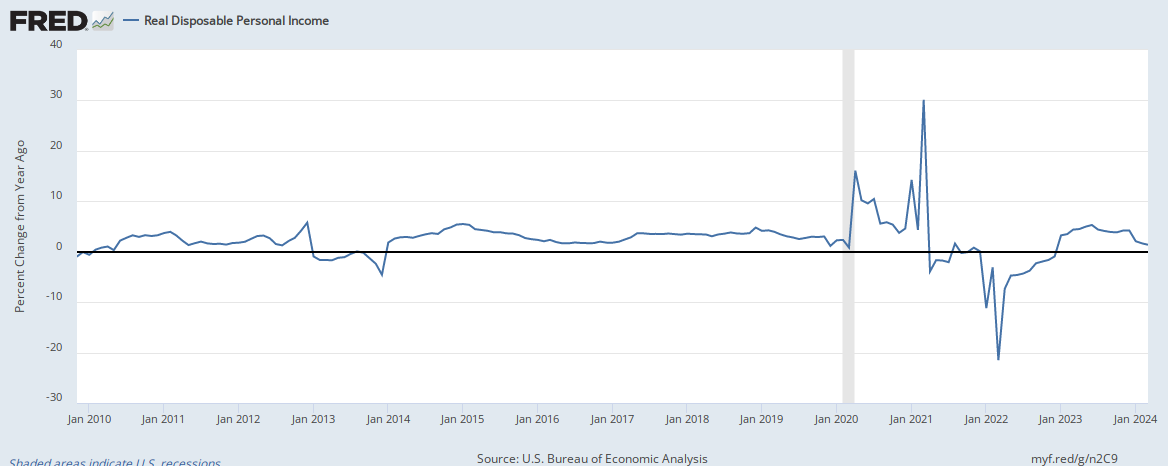
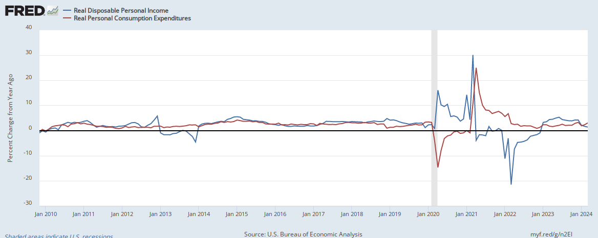
Yes, there was an event that transpired in 2016. For some strange reason, real disposable personal income fell in the United States, but consumption remained steady:
The data highlights two distinct points.
1.) When we raised taxes on wealthy people it doesn't reduce real consumption.
2.) When we cut taxes on wealthy people it doesn't increase real disposable income.
We can also observe that the fall in oil prices led to a fall in real disposable income (2016), which is perplexing given the elastic nature of energy demand in the U.S..