lol
Uh, no. In that graph, the red line is CO2, and blue is temperature. It's from a paper that -- surprise! -- shows how, yes, increases in CO2 precede increases in temperature. What most likely happened at the end of the last Ice Age is that there was an orbital shift, which caused enough warming to unlock sequestered CO2, which resulted in thousands of years of very gradual increases in temperature. This is evident when, like the authors of the paper, you look at proxy data from more than just one specific (cherry-picked) site.
http://www.atm.damtp.cam.ac.uk/mcintyre/shakun-co2-temp-lag-nat12.pdf
You try to equate proxy records and instrumental records, then try to deny what those records actually say? Seriously?
I've already explained to you how that is not correct. Try to pay attention.
:roll:
Yes, I'm familiar with Wood for Trees. It is
hilarious that one minute you proclaim that these data sources are invalid, then... present them as authoritative.
Since you don't seem to understand your own chart:
• Since you're working with satellite data, your chart is
very short -- 1978 to present.
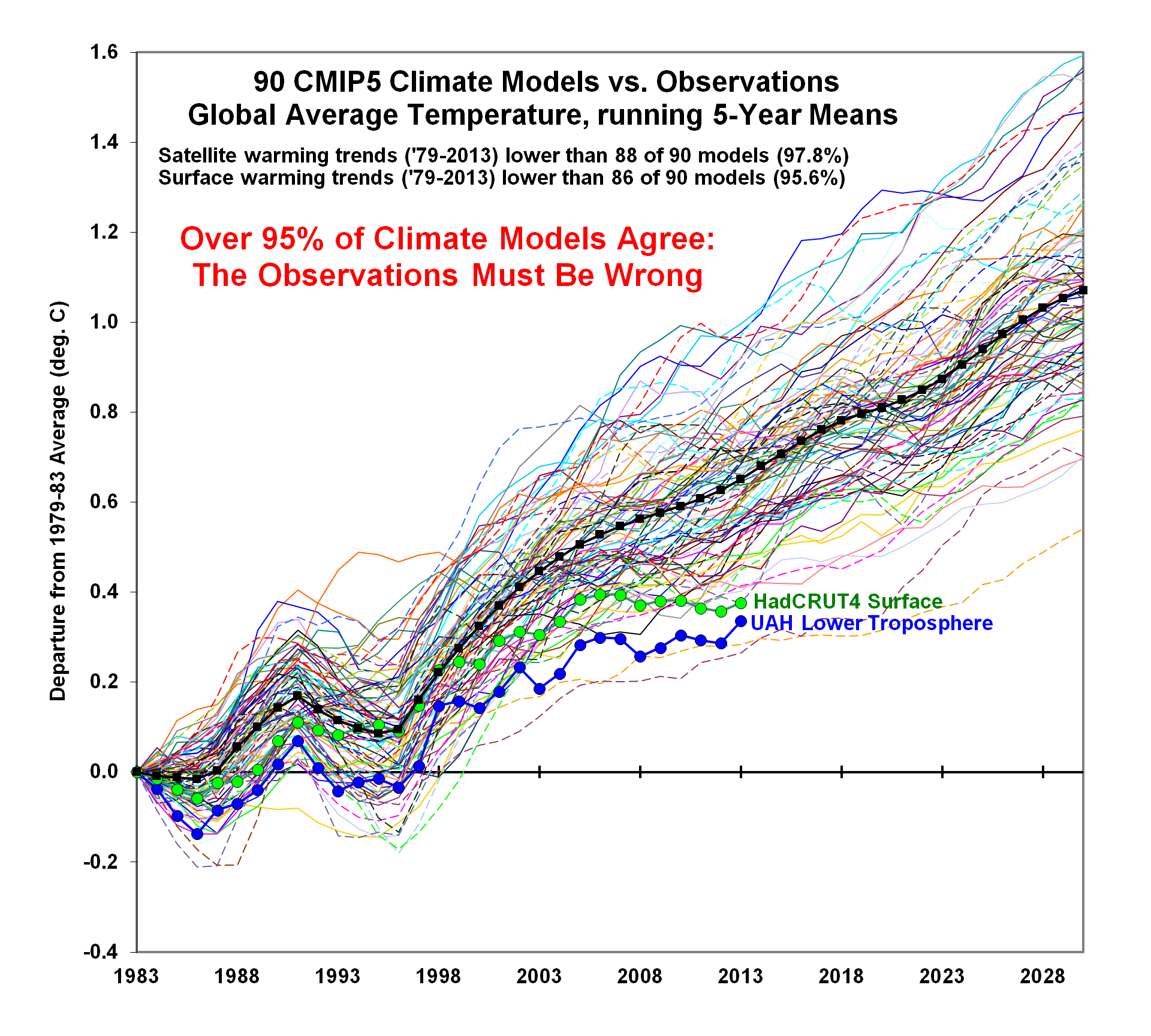
• GISTEMP and HADCRUT measure surface temperatures. UAH and RSS are satellites which measure the lower troposphere. I.e. they aren't measuring the same thing, thus it is not at all surprising that there are some differences (as well as powerful and important similarities).
• UAH is well-known for its failures to adjust for factors like changes in satellite orbit... and for being compiled by a pair of AGW deniers. Despite those problems, even UAH shows an increase in temperatures of roughly 0.4 to 0.5C in the past 30 years.
• HADCRUT v3 is outdated. You should use HADCRUT4 Global ("HADCRUT4GL").
• "WTI" is the site owner's own proprietary mix of HADCRUT4GL, GISTEMP, RSS and UAH. When the graph is set up
properly -- as seen in WTI's own notes on WTI -- then it ends up in the middle of the four measures (
Wood for Trees: Notes).
• Somehow, you missed the fact that even when we are looking at 1979 to present,
there is a significant -- and unprecedented -- increase in temperatures in a short period of time. How
convenient.
So, let's show a chart that
actually makes sense for comparing global temperature measures. Namely: GISS and HADCRUT4 are quite close from 1880 to present.
View attachment 67262256
On average, GISTEMP is around 0.076C higher than HADCRUT4 (i.e. no, that's not a huge amount). Guess what? Climate scientists are aware of this, and the reasons why (e.g. GISTEMP interpolates, HADCRUT does not; they use slightly different raw data sources; they apply slightly different adjustments etc).
Despite their very minor differences, the correlation coefficient for these two measures is 0.97 -- which, since you probably don't know what that means either, means that those two measures are highly correlated. (Even the problematic UAH6 is strongly correlated with GISTEMP and HADCRUTV4 -- 0.82.)