You still clutch to that one dataset?
That is only the lower atmosphere (up to 8k), and it only starts in 1979 (more on that in a bit). It doesn't include any surface or ocean temperatures. It doesn't include the upper atmosphere. It doesn't even include the
upper troposphere. While the data is useful in a larger context, it certainly is not a sole authoritative measure of global temperatures. Using it that way is a classic case of cherry-picking -- you are deliberately picking data that suits your purposes.
Of course, it doesn't do that very well anyway. Since you missed it, that dataset
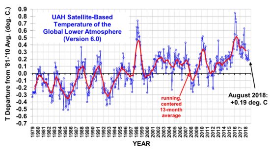
still shows an upward trend:
View attachment 67240408
Even if you pick a more recent time period, it
still shows an upward trend:
View attachment 67240409
We can also show decadal averages, to further illustrate the trajectory:
View attachment 67240410
Meaning you have to do even
MORE cherry-picking to proclaim there is any trend other than "up." You would have to pick 2016 to present, and ignore how 2016 was an El Nino year
and the hottest on record, and ignore that 2017 was the 2nd or 3rd hottest non-El Nino year on record. Needless to say, this is not legitimate; there are numerous periods where temperatures fell, and then increased by more than they fell; then fell again, then increased more than they fell again... That happened
9 times since 1979, and the trend is
still up. According to UAH, the trend is an increase of 0.13ºC per decade.
Another illegitimate method you've used in the past is to deliberately select the 2nd hottest year in this dataset as your starting point. Pass.
Another problem with using UAH exclusively? As already mentioned, satellite data starts in 1979, which means that the anomalies can only go back as early as 1979. Other temperature measures use different baselines -- 1900-2000, or 1950-2000. Either way, it's cutting out decades of warming, and makes the amount of warming look smaller than it actually is.
Last but not least: Temperature projections refer to... wait for it...
surface temperatures. Comparing UAH LTT measurements to SST projections is at best inappropriate. What you're doing in this thread is equivalent to saying "The CBO predicted US GDP growth of 2.5% in Q1, however Canada's GDP fell by 0.2%, therefore the CBO is wrong." Your claim just doesn't add up, as your entire reason to mention UAH in this context is invalid.