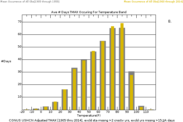
So you found an Anomaly (2% of Global land Mass) and only "Hot Days" as defined by "100F! - call them 1%.
So you seek to mislead using .02% of the land-days.
Wait, and only in summer, cut it more: 25% of of .02%. = .005% of land-days.
Of course,
if ie, Alaska is in the numbers, the Largest USA state, and it gets to 80F, that IS a "Hot Day", even if not 100F. (ie, in Phoenix). Or if NYC hits 73F, as it did last Christmas eve, that's also NOT covered, as Winter is not in the stats.
So that would now put your anomaly well under .005%
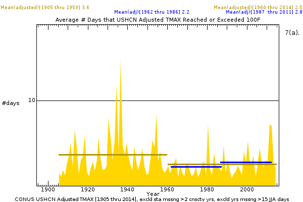
A Broader view:
the whole Northern Hemisphere 'Hot Days' which are Increasing steadily and significantly.
The New Climate Dice: Public Perception of Climate Change
By James Hansen, Makiko Sato, Reto Ruedy — August 2012
NASA GISS: Science Brief: The New Climate Dice: Public Perception of Climate Change
"...Temperatures simulated in a global climate model (Hansen et al., 1988) reached a level such that four of the six sides of the climate dice were red in the first decade of the 21st century for greenhouse gas scenario B, which is an accurate approximation of actual greenhouse gas growth (Hansen and Sato 2004; updates are provided by a Columbia Univ. webpage).
Observed summer temperature anomalies over global land during the past decade averaged about 75% in the "Hot category", thus midway between four and five sides of the die were red, which is reasonably consistent with expectations.
Figure 3. Frequency of occurrence (vertical axis) of local June-July-August temperature anomalies (relative to 1951-1980 mean) for Northern Hemisphere land in units of local standard deviation (horizontal axis). Temperature anomalies in the period 1951-1980 match closely the normal distribution ("bell curve", shown in green), which is used to define cold (blue), typical (white) and hot (red) seasons, each with probability 33.3%. The distribution of anomalies has shifted to the right as a consequence of the global warming of the past three decades such that cool summers now cover only half of one side of a six-sided die, white covers one side, red covers four sides, and an extremely hot (red-brown) anomaly covers half of one side. Image credit: NASA/GISS.
The relation between the bell curve and climate dice is illustrated in Fig. 3.
Extremely hot outliers already occur more frequently than unusually cold seasons. If the march of the bell curve to the Right continues unabated, within a few decades even the seasons that were once considered average will cease to occur.
We have shown that
the increased frequency of "hot" seasons is a result of global warming. The cause of global warming is a separate matter, but observed global warming is now attributed with high confidence to increasing greenhouse gases (IPCC 2007a).
Both attributions are important.
Together they allow us to infer that the area covered by extreme hot anomalies will continue to increase in coming decades and that even more extreme outliers will occur. Indeed, we conclude that the decade-by-decade shift to the right of the temperature anomaly distribution (Fig. 2) will continue...
[......]
And that ladies and gentleman, is what these Disingenuous skeptics do for a living. Find misleading BS.
Here is someone who is a Climate guy, perhaps professional, but he still can't pull the wool over just one plain smart general poster.