• This is a political forum that is non-biased/non-partisan and treats every person's position on topics equally. This debate forum is not aligned to any political party. In today's politics, many ideas are split between and even within all the political parties. Often we find ourselves agreeing on one platform but some topics break our mold. We are here to discuss them in a civil political debate. If this is your first visit to our political forums, be sure to check out the RULES. Registering for debate politics is necessary before posting. Register today to participate - it's free!

A simplistic evaluation of climate modelling

Mithrae

DP Veteran
Joined
Sep 15, 2013
Messages
8,310
Reaction score
4,112
Location
Australia
Gender
Male
Political Leaning
Liberal
...though admittedly not quite as simplistic as all the 'sceptic' assessments I've so far seen :lol:

I'm just going to cobble together a few posts I've made in other threads, mainly because in some recent posts my look at the issue has been even less simplistic than in previous years.

Post #1 will be a brief look at the state of climate modelling in the early 1980s, specifically with reference to Hansen et al 1981;
Post #2 will look briefly at the forecasting of surface temperatures from IPCC Assessment Reports;
Post #3 will glance at hindcasting of surface temperatures by the current CMIP5 crop of models, and
Posts #4 and #5 will have a squiz at the troposphere model/observation comparison popularized by Doctors Christy and Spencer.

It's going to be long, and probably boring and disjointed, but I think there's some worthwhile counter-propaganda here :cool:

##

Looking at the state of climate modeling in the early 1980s
A post from May 2014:
Predicting a straight line continuation of the previous trend obviously would not have been the case of a study published in 1981. At the time of publication the 5-year mean of global temperatures which the authors would have been seeing would have looked something like this (red):
mean:61


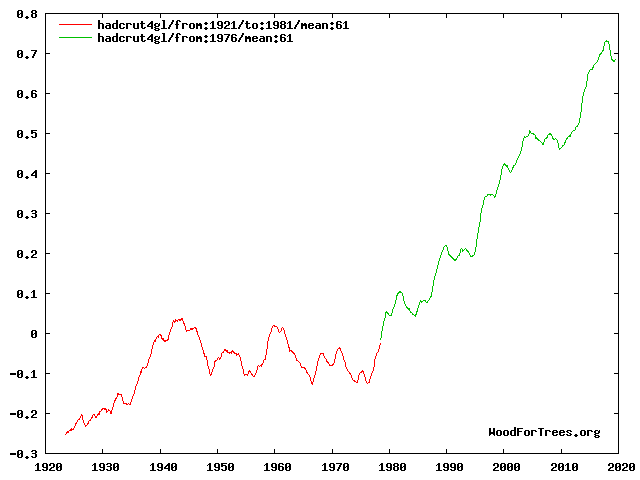
Extrapolating from the preceding 35 years' trend would suggest a 0.1 degree decrease in temperatures over the next 35 years.

Instead, based on the laboratory-confirmed fact that increasing greenhouse gases will increase temperatures, their narrow range of projections correctly anticipated an increase in temperatures of about 0.5 degrees up to the present.
Hansen et al, 1981; Science, Vol. 213
Hansen81.jpg

In a 2012 evaluation of the paper, Geert Jan van Oldenborgh and Rein Haarsma of the Royal Netherlands Meteorological Institute (KNMI) noted:
"They got 10 pages in Science, which is a lot, but in it they cover radiation balance, 1D and 3D modelling, climate sensitivity, the main feedbacks (water vapour, lapse rate, clouds, ice- and vegetation albedo); solar and volcanic forcing; the uncertainties of aerosol forcings; and ocean heat uptake. Obviously climate science was a mature field even then: the concepts and conclusions have not changed all that much. Hansen et al clearly indicate what was well known (all of which still stands today) and what was uncertain."

Of course as we see in hindsight, the warming trend continued very rapidly throughout the 1980s, so that by the time of the IPCC's First Assessment Report many papers (including Hansen's subsequent work) projected higher temperature increases: The observed warming has been well within the IPCC 1990 projections, but at the lower end (0.3 degree increase observed, of a 0.2 to 0.7 degree range). Ironically, the downward revised projection ranges in SAR 1996 and TAR 2001 have ended up being the only times so far in which the long-term mean has strayed outside the IPCC projections - long-term observations were higher than those projections during 1997-2003 (though still within the FAR range; see AR5 WG1 Figure 1.4).
 
Last edited:
Looking at the forecasting of surface temperatures from IPCC Assessment Reports
From a post in April 2014:

AR5 Figure 1.4 is not hard to find, and therefore nor is FAR Figure 6.11 which it references.
IPCC First Assessment Report - Chapter 6 (pdf)

Under the 'Business as Usual' scenarios it projects around 0.4 degrees' contribution of GHGs to surface warming from 1990 to 2013 for a climate sensitivity of 1.5 degrees, or 0.55 degrees' contribution for a climate sensitivity of 2.5 degrees.

IPCCFAR.jpg

Note that the 'Business as Usual' scenario is probably higher than actual emissions. It projects annual economic growth of 2-3% in OECD countries and 3-5% in developing countries with broadly corresponding increases in GHGs - "energy supply is coal intensive and on the demand side only modest efficiency increases are achieved" - whereas actual CO2 emissions have increased on average less than 1.5% per year and methane growth slowed dramatically during the 2000s.
https://www.ipcc.ch/ipccreports/far/wg_I/ipcc_far_wg_I_app_01.pdf
Global Carbon Dioxide Emissions — Facts and Figures
Atmospheric methane - Wikipedia, the free encyclopedia

Since the surface warming since 1990 has been around 0.3 degrees - with declining solar activity and increased ocean heat uptake - the actual GHG contribution has apparently fallen somewhere in between the above projections (but below the projection for a 4.5 degree sensitivity).
Wood for Trees: Interactive Graphs


####


From a post in February 2016:
As of 2013 the long-term temperature trend remained within the projection envelope of the First Assessment Report, and in the middle third of the envelopes from the Second and Third reports - right where they should have been. Since then, the record breaking year of 2014, and the even more record-shattering year 2015 has brought the trend up considerably.

From the First Assessment Report (BaU = 'business as usual' scenario):
IPCCFAR.jpg

From the Fifth Assessment Report:
Fig1-04.jpg
 
Last edited:
Looking at the hindcasting by CMIP5 models
From a post today:
0.21/decade is the CMIP5 modeled surface temperature trend for the fifteen year period 1998-2012 inclusive. For the fifteen year period 1984-1998 inclusive, the modeled trend was 0.16C/decade.

As I posted [above], when it comes to mid-term forecasting of global surface temperature trends the projections of the SAR and TAR seem to fare rather well over their twenty and fifteen year periods respectively (and probably AR4 also by the end of this year, though after a mere five years, when AR5 was published, it obviously wasn't doing so well!).

When it comes to hindcasting, we ought to bear in mind that if the models are generally pretty solid but some particular period falls above or below the multi-model mean, focusing only on that period would simply be a case of cherry-picking. And indeed, hindcasting over the whole period of the temperature record, there are several short time periods of divergence but overall the CMIP5 models do quite well (AR5 WG1 Figure 9.8):
Fig9-08.jpg


Obviously the observed temperature trend for the fifteen years beginning with 1998 was considerably lower than the multi-model mean trend of 0.21C/decade. On the other hand, as the IPCC evaluation of the models goes on to note, for the fifteen years ending with 1998, the observed trend was considerably higher: For HadCRUT4 it was 0.26C/decade, or 62.5% higher than the modeled trend. For GISS it was 0.213 C/dec, or 33.1% higher than the modeled trend. So the models fare rather well over the long term, and less so over shorter periods, but not because of an inherent 'warming' bias or overemphasis of GHGs as Flogger earlier suggested; more likely, because of difficulty in capturing all the nuances of decadal internal variability.

Moreover to illustrate the effects of selecting particular start and end points for short-term comparison (though the IPCC doesn't directly make the point in this case), over the period 1999-2013 the HadCRUT and GISS observational trends are about 62% and 27% larger than the 1998-2012 trends respectively. So compared to the modeled trend of 0.21C/dec over (almost) that period, those observational trends are about 61.4% and 39.5% lower. Averaging the whole 30-year period, the modeled trend would be (about) 0.185C/decade, while both HadCRUT and GISS have almost identical trends slightly higher than 0.17C/decade.

Code:
Decadal trend
	84-98	98-12	99-13	84-13
CMIP5	0.16	0.21	>0.21	~0.185
HadCRUT	0.26	0.05	0.081	0.175
	62.5%		61.4%
GISS	0.213	0.1	0.127	0.173
	33.1%		39.5%

And obviously, as already noted, coming forward to the present the consecutive record-breaking years of 2014 and 2015 have brought the overall recent observational trend up further.
 
Last edited:
Looking at tropospheric model/observation comparisons
From recent posts:

As far as the precious IPCC models go

View attachment 67196763

This is a five year running mean temperatures predicted by UN IPCC models and observations by weather balloons and satellites. University of Alabama’s John Christy presentation to the House Committee on Natural Resources on May 15, 2015.
Well you do keep delivering, I'll give you that. The surface temperatures, as shown in my post above, are consistent with the models' projections. Temperature trends at the surface are obviously what is of most interest and concern to us, since we happen to live there. As for atmospheric temperatures, the RSS lower troposphere temperature (TLT) trend is 0.124 degrees per decade; their 'total troposphere' (TTT) trend is 0.115K/dec; but the 'mid troposphere' (TMT) trend is only 0.081K/dec... so where does 'sceptic' Dr. John Christy focus?

Moreover, the most obvious reason to focus on tropospheric (rather than surface) temperatures is in consideration of the so-called 'tropospheric hot spot' simulated by climate models; a particular phenomenon in which the tropical troposphere is supposed to warm faster than the surface. In the tropics - 25N to 25S - the RSS total troposphere trend of 0.129K/dec does indeed exceed their global lower troposphere trend. The difference is more pronounced when compared with the tropical TLT trend of 0.108. (This, by the way, is also simulated by climate models; the polar amplification effect among others leaving equatorial trends smaller than the higher latitude, and therefore global trends.) Even their tropical 'mid troposphere' trend of 0.095 is larger than the global trend. So why does Christy focus on global mid troposphere temperatures... if not for the sole reason that they are the lowest trend available?

You certainly know how to keep on topic in a thread about cherry-picking :lol:

fig-9-01.jpg
(Figure 9.1 from the IPCC's Fourth Assessment Report WG1; the modeled response from 1890 to 1999 of various factors, including the panels for well-mixed greenhouse gases (c) and total (f) which show the 'tropospheric hot spot.'

Curiously, Christy's own UAH atmospheric temperature series doesn't include a total troposphere product, only the comparatively cooler 'mid troposphere.' Unlike the lower and total troposphere series, the 'mid troposphere' series is a single channel product which includes some weighting from as high as 25km in the atmosphere. Therefore far from showing only tropospheric temperatures, RSS notes that the TMT is biased somewhat by the cooling in the lower stratosphere. (-0.26K/decade from their TLS product; again simulated by the models as seen in the AR4 figure above, and a characteristic 'fingerprint' produced by GHGs but not for example by higher solar irradiance.) RSS introduced their TTT product to remove some of that stratospheric cooling bias in response to Fu and Johannson, 2005. Ten years later, Doctors Christy and Spencer still don't seem to have got the memo.


Continued below due to length...
 
Last edited:
Continued from above:
I actually do appreciate the opportunity to research and learn some of this stuff, Flogger :) In examining this issue we have learned:

> That Christy chose to cherry-pick the stratosphere-biased global 'mid troposphere' temperatures for comparison, rather than surface, or total troposphere, or tropical total troposphere or even tropical 'mid troposphere'
> That lower troposphere trends are smaller near the equator than closer to the poles/global mean, as simulated by climate models
> That total and 'mid' troposphere trends are larger near the equator, as simulated by climate models
> That the total troposphere trend near the equator is higher than the lower troposhere trend, as simulated by climate models
> That the lower stratosphere shows a large cooling trend, as simulated by climate models (and a distinctively GHG-oriented signal)

Interesting stuff, isn't it?

Now, has the tropospheric trend been as large as the models predict? No. The divergence certainly isn't as great as Christy's graph implies. But the models suggest tropical troposphere warming at least 60% higher than nearer the surface, which means compared with the tropical TLT trend of 0.108K/decade, there should be a trend of at least 0.16 in the tropical TTT; RSS shows only 0.129K/decade. That means the model/observation divergence from 1979-2015 is more like 0.2 degrees instead of the 0.6 degrees Christy's graph implies. But it's still a divergence. [Note: A subsequent, less rushed estimate was that the divergence is actually around 0.33 degrees.]

Maybe the models are not yet perfect. No-one ever said they are. In fact, relatively accurate though they've been for projecting surface temperatures, they are obviously far more complicated than that single simple metric would imply and they certainly are not yet perfect. Maybe this is one of the areas in which there's room for improvement. In the IPCC's "Evaluation of Climate Models" (AR5, WG1 Chapter 9) it's clearly stated that one of the biggest, perhaps the biggest area of uncertainty in climate modelling is clouds. Since the 'tropospheric hot spot' is produced by condensation of water vapour, that could well be the reason for the divergence. Others propose that the many adjustments to the atmospheric temperature series don't correctly emulate the actual temperature trends: In one article Australian climate scientist Prof. Steven Sherwood cites his own 2015 study and two others to that effect. It seems unlikely to me, given the convergence between both satellite and balloon data sets - though perhaps the balloon data has some systemic bias which the satellite records have failed to uncover, and simply mirrored in the attempt to avoid divergence from those more direct temperature measurements.

An interesting topic, for sure: But certainly not the simple-minded, black and white issue you seem to think it is.
 
Last edited:
You say it is not a "simple-minded, black and white issue" yet present us with most of what was used and what the thinking was behind the hockey stick graph.
 
You say it is not a "simple-minded, black and white issue" yet present us with most of what was used and what the thinking was behind the hockey stick graph.

None of this has anything to do with MBH99. Please explain?
 
I guess if you simply keep moving the climate modelling goalposts ever further apart in order to keep observations within the AGW narrative then any range of guesses can be made to look plausible.

That doesn't mean they are of course :roll:
 
..

Instead, based on the laboratory-confirmed fact that increasing greenhouse gases will increase temperatures, their narrow range of projections correctly anticipated an increase in temperatures of about 0.5 degrees up to the present.
You seem to have done a good job of laying out your case,
But I do not think there is actual lab confirmation of the climates sensitivity to increased CO2.
I am not saying I do not think added CO2 causes warming, but rather that the warming has not been
confirmed in a lab.
If you know of an actual lab confirmation, I would like to read how they addressed the boundary condition.
The real crux of the discussion is not about the sensitivity of CO2, which most place at between
.8 and 1.3 C for a doubling, but on the amount of positive amplified feedback.
Some researchers like Lindzen think the equilibrium climate sensitivity (ECS) is about .7 C,
Saying clouds will have a larger negative feedback than predicted.
Lindzen and Choi (2011)
I think Dr. Curry places the ECS at about 1.5 to 1.8 C
Lewis and Curry (2014)
The IPCC has a range of 1.5 to 4.5 C,
Baede (2001)
The empirical data, which is limited, looks like if we project the curve forward,
the likely result would be about 1.8 C, if we could actually double the CO2 level.
Would an increase of 1.8 C over a 200 year window be bad?
Considering that about 1.3 C of the 1.8 C, would be in nighttime lows not going as low.
http://pubs.giss.nasa.gov/docs/1995/1995_Hansen_etal_2.pdf
There would be some reduction in chill hours, which could effect fruit trees like apples.
The duty cycle of any change would likely occur outside of the crop refresh cycle.
How long do fruit trees live? | Dave Wilson Nursery
The sea level is increasing at the same rate it has been for for within our measurement window,
and does not appear to be accelerating.
We will have to address it as a fact of life, not as a fact of AGW.
Many of the other catastrophic predictions, are predicated of the higher end warming actually occurring,
which at this point does not seem likely.

As I have said before, we have real problems, energy storage, and fresh water,
solving the energy storage problem, will as a side effect solve any issues with CO2.
Currently, I think man made hydrocarbon fuels, is the best, and most likely path forward.
Solar, wind and other alternative energy sources can provide enough energy, it just is
not dense enough and not compatible with existing needs.
Storing the energy as hydrocarbon fuel, allows the energy to be accumulated in a high density
"container" compatible with existing infrastructure and needs.
 
You seem to have done a good job of laying out your case,
But I do not think there is actual lab confirmation of the climates sensitivity to increased CO2.
I am not saying I do not think added CO2 causes warming, but rather that the warming has not been
confirmed in a lab.

Aye and theres the rub. Who's to say that the increased temperatures and CO2 levels will not actually represent a net benefit to the biosphere ? The last three decades of direct satellite observation would seem to confirm the latter may in fact be the case.

Empirical data confirms that the biosphere’s productivity has increased by about 14% since 1982, in large part as a result of rising carbon dioxide levels.

Thousands of scientific experiments indicate that increasing carbon dioxide concentrations in the air have contributed to increases in crop yields.

These increases in yield are very likely to have reduced the appropriation of land for farming by 11–17% compared with what it would otherwise be, resulting in more land being left wild.

Satellite evidence confirms that increasing carbon dioxide concentrations have also resulted in greater productivity of wild terrestrial ecosystems in all vegetation types.

Increasing carbon dioxide concentrations have also increased the productivity of many marine ecosystems.

In recent decades, trends in climate-sensitive indicators of human and environ- mental wellbeing have improved and continue to do so despite claims that they would deteriorate because of global warming.

Compared with the benefits from carbon dioxide on crop and biosphere productivity, the adverse impacts of carbon dioxide – on the frequency and intensity of extreme weather, on sea level, vector-borne disease prevalence and human health – have been too small to measure or have been swamped by other factors.

Models used to influence policy on climate change have overestimated the rate of warming, underestimated direct benefits of carbon dioxide, overestimated the harms from climate change and underestimated human capacity to adapt so as to capture the benefits while reducing the harms.

It is very likely that the impact of rising carbon dioxide concentrations is currently net beneficial for both humanity and the biosphere generally. These benefits are real, whereas the costs of warming are uncertain. Halting the increase in carbon dioxide concentrations abruptly would deprive people and the planet of the benefits of carbon dioxide much sooner than they would reduce any costs of warming.]


http://www.thegwpf.org/content/uploads/2015/10/benefits1.pdf
 
After looking at the first 5 posts I suggest you change the title of the thread. :mrgreen:
 
After looking at the first 5 posts I suggest you change the title of the thread. :mrgreen:

Its almost as if the poster feels that his volume of verbage about climate models will compensate for the fact that they don't actually work :wink:

Here is why they don't

http://c3headlines.typepad.com/.a/6a010536b58035970c0120a5c9415b970b-pi

And the results ?

C3: Climate Change Models, Computer Simulations, Scenarios

95% of Climate Models Agree: The Observations Must be Wrong « Roy Spencer, PhD
 
Last edited:
If you know of an actual lab confirmation, I would like to read how they addressed the boundary condition.

A single lab experiment can't establish climate sensitivity - factors such as atmospheric layering and variable H2O concentrations would be too difficult to replicate - but they've established the relative absorption effects of the various greenhouse gases at different pressures, ratios, temperatures, and concentrations, from which effects in the atmosphere can be calculated. This seems to be a pretty comprehensive list of relevant studies:
https://agwobserver.wordpress.com/2...ry-measurements-of-co2-absorption-properties/

Some of those from the 60s seem to be particularly relevant, eg:

Laboratory investigation of the absorption and emission of infrared radiation – Burch & Gryvnak (1966)

and

Absorption Line Broadening in the Infrared – Burch*et al.*(1962)*“The effects of various gases on the absorption bands of nitrous oxide, carbon monoxide, methane, carbon dioxide, and water vapor have been investigated.”

Total Absorptance of Carbon Dioxide in the Infrared – Burch*et al.*(1962)*“Total absorptance… has been determined as a function of absorber concentration w and equivalent pressure Pe*for the major infrared absorption bands of carbon dioxide with centers at 3716, 3609, 2350, 1064, and 961 cm−1.”

As for the boundary conditions, is there any particular reason the effect couldn't simply be measured through control runs and the results corrected accordingly?

longview said:
The empirical data, which is limited, looks like if we project the curve forward,
the likely result would be about 1.8 C, if we could actually double the CO2 level.

From past discussions you're not allowing for thermal inertia however; the fact that even if all forcings and all feedbacks remained steady from this day on, it would still take some decades for the ocean to even approach thermal equilibrium (centuries to fully reach it). In other words it's an estimate more appropriately comparable to the IPCC's transient climate response (TCR) 'likely' range of 1-2.5 degrees than to its equilibrium climate sensitivity (ECS) 'likely' range of 1.5-4.5.

Hansen et al 2005 imply that for a climate sensitivity of 0.75K per W/m^2 (ie, around 2.8 degrees CO2 sensitivity) it could take 25-50 years to reach 60% of the surface temperature equilibrium response. The lag time would be shorter with lower sensitivity: But even assuming it was as low as fifteen years (since a helpful thread on this forum suggests that 30% of CO2 emissions have occurred in that timeframe), that would mean that by this point at least 40% of the response from the last 15 years (30%) of CO2 increases would not have been manifest in the surface temperatures yet, even without natural variability getting in the way. Accounting for thermal inertia in that manner would mean that your TCR-ish figure is 12% less than a more ECS-like figure, which would hence mean a climate sensitivity slightly over 2 degrees - and that'd be a fairly conservative estimate.


Bloody hell, 5000 characters is far too short a post limit. I almost never go over 7000, but the number of times it's above 5000 is extremely frustrating!
 
Last edited:
longview said:
Would an increase of 1.8 C over a 200 year window be bad?
Considering that about 1.3 C of the 1.8 C, would be in nighttime lows not going as low.
http://pubs.giss.nasa.gov/docs/1995/1995_Hansen_etal_2.pdf

I can't see where you got that figure from the paper. More easily accessible and recent figures are available from Lewis and Karoly 2013, suggesting (Figure 5) that since 1950 observed maximum temperatures had increased by ~0.18K/decade and minimum temperatures had increased by ~0.24K/decade. That would mean only about 57% of the warming was due to higher night-time lows. Note also (Verax pointed this out in a thread last year) that in its conclusion that paper by Hansen and co states that the smaller diurnal range (ie, nights warming faster than days) is an immediate effect of increasing GHGs, since it only involves retaining daytime heat during the night; higher temperatures due to the actual build-up/change in energy balance (the part which is subject to thermal inertia) should affect day and night-time temperatures more or less equally. So in the longer-term the warming contribution from higher night-time lows should be even smaller than 57%.

Also if it's a 1.8 degree temperature rise at the time of CO2 doubling (probably around the 2050s or 2060s in a business as usual scenario), it wouldn't be 1.8 degrees over 200 years: We've had about 0.6 degrees of warming since the 1970s (Wood for Trees, HadCRUT 10-yr mean), so it would be more like 1.5 degrees' warming in 80 or 90 years.

longview said:
Currently, I think man made hydrocarbon fuels, is the best, and most likely path forward.

I've always found your views on our energy future to be interesting and insightful - and you may be right :) I'm not so sure though; to replace fossil fuels, man-made hydrocarbons from renewable energy sources would need the renewable energy to be substantially cheaper. That'll probably happen in developed countries before too long (I think it's already the case for hydro and geothermal; arguably already the case for solar and wind if the external costs of fossil fuels are included, but that doesn't change the economic side of things), but perhaps not soon enough to match their obligations for avoiding a designated target (eg. as 2 degrees' warming), and I would guess that it'll take even longer in developing countries. More investment in renewables could obviously speed up the process.
 
Last edited:
A single lab experiment can't establish climate sensitivity - factors such as atmospheric layering and variable H2O concentrations would be too difficult to replicate - but they've established the relative absorption effects of the various greenhouse gases at different pressures, ratios, temperatures, and concentrations, from which effects in the atmosphere can be calculated. This seems to be a pretty comprehensive list of relevant studies:


As for the boundary conditions, is there any particular reason the effect couldn't simply be measured through control runs and the results corrected accordingly?
The absorption bands of CO2 are well known, CO2 is a very poor IR absorber! which is why when
we want excited CO2 like in a laser cavity, it is easier to vibrationally excite it with nitrogen.

As to the boundary conditions, In a lab setting, the edges of the container could easily cause greater
error than the measurement.


From past discussions you're not allowing for thermal inertia however; the fact that even if all forcings and all feedbacks remained steady from this day on, it would still take some decades for the ocean to even approach thermal equilibrium (centuries to fully reach it). In other words it's an estimate more appropriately comparable to the IPCC's transient climate response (TCR) 'likely' range of 1-2.5 degrees than to its equilibrium climate sensitivity (ECS) 'likely' range of 1.5-4.5.
Since we had a period of warming from 1910 to 1940, almost as great as the warming from 1978 to 1998,
that same thermal inertia should be present.
This is not a simple problem, As Dr. Curry says it is a wicked problem, as of yet the variables
appear to exceed the predicted effect.
 
I can't see where you got that figure from the paper. More easily accessible and recent figures are available from Lewis and Karoly 2013, suggesting (Figure 5) that since 1950 observed maximum temperatures had increased by ~0.18K/decade and minimum temperatures had increased by ~0.24K/decade. That would mean only about 57% of the warming was due to higher night-time lows. Note also (Verax pointed this out in a thread last year) that in its conclusion that paper by Hansen and co states that the smaller diurnal range (ie, nights warming faster than days) is an immediate effect of increasing GHGs, since it only involves retaining daytime heat during the night; higher temperatures due to the actual build-up/change in energy balance (the part which is subject to thermal inertia) should affect day and night-time temperatures more or less equally. So in the longer-term the warming contribution from higher night-time lows should be even smaller than 57%.
For Hansen's paper,
http://pubs.giss.nasa.gov/docs/1995/1995_Hansen_etal_2.pdf
Here is the section,
They find that the average minimum temperature increased 0.84°C while the average maximum
temperature increased only 0.28°C.
For your paper, they did some literary gymnastics, they appear to be comparing the models to the observed.
Other papers like,
http://www.atmos.albany.edu/facstaff/zhou/pdf/pdf_papers/Zhou_et_al_2010.pdf
The observed trends of Tmax,min, and DTR are +0.124,+0.224,
So the difference is not as great, but still the Tmin warming is almost double that of Tmax.


Also if it's a 1.8 degree temperature rise at the time of CO2 doubling (probably around the 2050s or 2060s in a business as usual scenario), it wouldn't be 1.8 degrees over 200 years: We've had about 0.6 degrees of warming since the 1970s (Wood for Trees, HadCRUT 10-yr mean), so it would be more like 1.5 degrees' warming in 80 or 90 years.

The baseline temperatures are based on 1951 to 1980 (GISS) average, but the total warming is usually
referred to as above pre industrial temperatures.
So the GISS anomaly is currently at .75 C, but the total warming is listed as .94 C, referenced to 1880.


I've always found your views on our energy future to be interesting and insightful - and you may be right :) I'm not so sure though; to replace fossil fuels, man-made hydrocarbons from renewable energy sources would need the renewable energy to be substantially cheaper. That'll probably happen in developed countries before too long (I think it's already the case for hydro and geothermal; arguably already the case for solar and wind if the external costs of fossil fuels are included, but that doesn't change the economic side of things), but perhaps not soon enough to match their obligations for avoiding a designated target (eg. as 2 degrees' warming), and I would guess that it'll take even longer in developing countries. More investment in renewables could obviously speed up the process.

Actually the costs may not be that far apart.
The adoption of the technology could well be like cell phones,
In some countries, it was cheaper to not go through the land line stage and go straight
to cell service. If the technology can be scaled down, it could be possible for
every village to have it's own solar fuel plant, running existing tractors on fuel from the sun.
The original idea from Germany was that Solar homes would produce natural gas in
the summer for winter heating, the gas would be stored in the natural gas transport grid.
This technology will become viable, when oil gets about $90 a barrel.
 
Given that it was Hansens doomsday address to congress in 1988 that launched this entire agenda it would be illuminating to check just how well his predictions from that time have fared

6a010536b58035970c01b7c80f47b6970b.jpg

C3: 2015 Update: A Few Takeaways On Climate Model Failures & Global Warming

Given humanity has essentially followed his scenario A 'business as usual' model it can be seen that just within that very short time his projections are already 0.7C too high. This represents an error as great as all the observed warming since 1900.

One also has to question Hansen's scientific objectivity too given his high profile anti capitalist political activism

The scientist: Jim Hansen risks handcuffs to make his research clear ? The Daily Climate
 
Looking at the forecasting of surface temperatures from IPCC Assessment Reports
From a post in April 2014:

AR5 Figure 1.4 is not hard to find, and therefore nor is FAR Figure 6.11 which it references.
IPCC First Assessment Report - Chapter 6 (pdf)

Under the 'Business as Usual' scenarios it projects around 0.4 degrees' contribution of GHGs to surface warming from 1990 to 2013 for a climate sensitivity of 1.5 degrees, or 0.55 degrees' contribution for a climate sensitivity of 2.5 degrees.

View attachment 67196893

Note that the 'Business as Usual' scenario is probably higher than actual emissions. It projects annual economic growth of 2-3% in OECD countries and 3-5% in developing countries with broadly corresponding increases in GHGs - "energy supply is coal intensive and on the demand side only modest efficiency increases are achieved" - whereas actual CO2 emissions have increased on average less than 1.5% per year and methane growth slowed dramatically during the 2000s.
https://www.ipcc.ch/ipccreports/far/wg_I/ipcc_far_wg_I_app_01.pdf
Global Carbon Dioxide Emissions — Facts and Figures
Atmospheric methane - Wikipedia, the free encyclopedia

Since the surface warming since 1990 has been around 0.3 degrees - with declining solar activity and increased ocean heat uptake - the actual GHG contribution has apparently fallen somewhere in between the above projections (but below the projection for a 4.5 degree sensitivity).
Wood for Trees: Interactive Graphs

####


From a post in February 2016:
As of 2013 the long-term temperature trend remained within the projection envelope of the First Assessment Report, and in the middle third of the envelopes from the Second and Third reports - right where they should have been. Since then, the record breaking year of 2014, and the even more record-shattering year 2015 has brought the trend up considerably.

From the First Assessment Report (BaU = 'business as usual' scenario):
View attachment 67196893

From the Fifth Assessment Report:
Fig1-04.jpg


The problem with this line of argument is it simply muddies the water and hides the direct comparison between the CMIP5 models and the observational data. There is no need, for instance, to include any CMIP5 model that is based on incorrect CO2 scenarios. The method of presenting FAR, SAR and TAR as collective ranges is simply dishonest as the range of these annual reports is based on variation in expected CO2 levels from a constant CO2 forcing, so the range in FAR SAR and TAR are derived from CO2 concentration as a variable, while the observational data is temperature variability.

So the only real question to be asked and answered from these comparisons is how the climate data correlated to CMIP5 high CO2 scenario. But then the observational data has already fallen below the lower boundary for all three of the presented CMIP5 models, it just happens to come closer to the low estimate CO2 scenario.

All of this points to the CO2 forcing used in CMIP5 being too high.
 
Last edited:
The problem with this line of argument is it simply muddies the water and hides the direct comparison between the CMIP5 models and the observational data. There is no need, for instance, to include any CMIP5 model that is based on incorrect CO2 scenarios. The method of presenting FAR, SAR and TAR as collective ranges is simply dishonest as the range of these annual reports is based on variation in expected CO2 levels from a constant CO2 forcing, so the range in FAR SAR and TAR are derived from CO2 concentration as a variable, while the observational data is temperature variability.

So the only real question to be asked and answered from these comparisons is how the climate data correlated to CMIP5 high CO2 scenario. But then the observational data has already fallen below the lower boundary for all three of the presented CMIP5 models, it just happens to come closer to the low estimate CO2 scenario.

All of this points to the CO2 forcing used in CMIP5 being too high.

Which simply boils down to the fact that single remit political bodies like the IPCC should not be tasked with making scientific determinations of this nature.
 
You seem to have done a good job of laying out your case,
But I do not think there is actual lab confirmation of the climates sensitivity to increased CO2.
I am not saying I do not think added CO2 causes warming, but rather that the warming has not been
confirmed in a lab.

Sure it has. Experiment: take one spare planet, add 1.3 trillion tonnes of CO2 to the atmosphere. Monitor surface temperature. Allow for thermal inertia and the logarithmic effect of CO2 from Beer's Law. Results:

19391738322_6c1f95ebfe_o.jpg


If you know of an actual lab confirmation, I would like to read how they addressed the boundary condition.

When the whole planet is your lab, there are no boundary conditions to address.

The real crux of the discussion is not about the sensitivity of CO2, which most place at between
.8 and 1.3 C for a doubling, but on the amount of positive amplified feedback.
Some researchers like Lindzen think the equilibrium climate sensitivity (ECS) is about .7 C,
Saying clouds will have a larger negative feedback than predicted.
Lindzen and Choi (2011)
I think Dr. Curry places the ECS at about 1.5 to 1.8 C
Lewis and Curry (2014)
The IPCC has a range of 1.5 to 4.5 C,
Baede (2001)

The empirical results above prove that Lindzen, Choi, Lewis, and Curry are all wrong. Further, the reason for their erroneous conclusions have already been discovered and discussed.


The empirical data, which is limited, looks like if we project the curve forward,
the likely result would be about 1.8 C, if we could actually double the CO2 level.

Incorrect. To determine sensitivity from the empirical data, take the slope of the above empirical graph and multiply by ln(2). Thus 3.8952 x .69315 = 2.7°C per CO2 doubling.

Would an increase of 1.8 C over a 200 year window be bad?

Well gee, that's only five times faster than the fastest global temperature rise in the geological record, so I guess the worst that could happen is 200 feet of sea level rise, global mass extinction, and the end of human civilization. But if we get lucky, it'll only be 10,000 years of misery. So nothing much. These aren't the droids you're looking for. Move along.
 
Last edited:
Sure it has. Experiment: take one spare planet, add 1.3 trillion tonnes of CO2 to the atmosphere. Monitor surface temperature. Allow for thermal inertia and the logarithmic effect of CO2 from Beer's Law. Results:

When the whole planet is your lab, there are no boundary conditions to address.


The empirical results above prove that Lindzen, Choi, Lewis, and Curry are all wrong. Further, the reason for their erroneous conclusions have already been discovered and discussed.
So when you say discovered and discussed, you mean Realclimate.org has applied their corrective estimate
to published peer reviewed work.


Well gee, that's only five times faster than the fastest global temperature rise in the geological record, so I guess the worst that could happen is 200 feet of sea level rise, global mass extinction, and the end of human civilization. But if we get lucky, it'll only be 10,000 years of misery. So nothing much. These aren't the droids you're looking for. Move along.
Five times faster that a record with a resolution of over a century.
Since the portion of the instrument record of concern is from 1978 to 1998, it is really questionable,
if such an increase would even show up in the geological record.
A twenty year spike could have occurred dozens of times in the last few millennia.
 
So when you say discovered and discussed, you mean Realclimate.org has applied their corrective estimate
to published peer reviewed work.

No, it actually means that peer-reviewed science has discovered the flaw, and the peer-reviewed science has been (predictably) ignored on the blogs of Denierstan. Which is why you never heard of it until I told you.

Meanwhile, NOT ONE WORD refuting the actual science from you. Because ad-homs are soooo much easier than, you know, actual thinking. Typical of Denierstan, but you'll have to do better than that if you want to convince anybody outside of your fact-free bubble.

Five times faster that a record with a resolution of over a century.
Yes, but de-resolving the current global temperature record to over a century shows the same warming you cited. So you've just mathematically disproved your own thesis.

Since the portion of the instrument record of concern is from 1978 to 1998, it is really questionable,

Count on the denziens of Denierstan to ignore all the data they want, in their rush to display their lack of grasp of the truth. So go ahead and throw away a century's worth of data, and you can spend the rest of the day hoping nobody will notice.

Sorry, dude, but we noticed. You're busted.

if such an increase would even show up in the geological record.

Yeah, why rely on science when raw speculation is so much more in tune with one's political beliefs?

http://content.csbs.utah.edu/~mli/Economics 7004/Marcott_Global Temperature Reconstructed.pdf

A twenty year spike could have occurred dozens of times in the last few millennia.

Not without being obvious in the data.
 
No, it actually means that peer-reviewed science has discovered the flaw, and the peer-reviewed science has been (predictably) ignored on the blogs of Denierstan. Which is why you never heard of it until I told you.

Meanwhile, NOT ONE WORD refuting the actual science from you. Because ad-homs are soooo much easier than, you know, actual thinking. Typical of Denierstan, but you'll have to do better than that if you want to convince anybody outside of your fact-free bubble.
Actually your much touted graph lacks a temporal component, so is not worth discussing.


Yes, but de-resolving the current global temperature record to over a century shows the same warming you cited. So you've just mathematically disproved your own thesis.
Nope! the proxy records lack the resolution to see if similar temperature changes have occurred before.
They may or may not have, we just cannot tell.


Count on the denziens of Denierstan to ignore all the data they want, in their rush to display their lack of grasp of the truth. So go ahead and throw away a century's worth of data, and you can spend the rest of the day hoping nobody will notice.

Sorry, dude, but we noticed. You're busted.
The period where CO2 was supposed to have an effect is post 1950, The vast majority
of the observed warming after 1950, was in the 20 years between 1978 and 1998,
This period is also the basis for many of the models.


Yeah, why rely on science when raw speculation is so much more in tune with one's political beliefs?
The Science is in the measurements, The resolution

http://content.csbs.utah.edu/~mli/Economics 7004/Marcott_Global Temperature Reconstructed.pdf
The Science is in the measurements, The resolution of Marcott is stated as an average of 120 years.
Look I pulled it from your own link, Cool!
The 73 globally distributed temperature records used in our analysis are based on a variety
of paleo temperature proxies and have sampling resolutions ranging from 20 to 500 years,
with a median resolution of 120 years (5).


They can say all they want, that they can resolve measurements of greater resolution than the
system possesses, it still does not mean they can.
Significant Figures in measurements are real things that have real limitations.

If someone told you they measured a parking lot as being 755 feet across by driving their
car with it's .1 mile increment odometer, you would have reason to be skeptical.
Any measurements beyond the systems capability, is purely guesswork.
 
Actually your much touted graph lacks a temporal component, so is not worth discussing.

Actually, CO2 forcing should cause the same amount of climate change regardless of any temporal component. So your evasion of the truth turns out to be, well, just another Denyin' Denier from Denierstan Denying the truth, because it interferes with his political doctrine.

You can always tell when the deniers lose, because they don't want to discuss the evidence. FAIL.

Nope! the proxy records lack the resolution to see if similar temperature changes have occurred before.
They may or may not have, we just cannot tell.

Nope! With 10917 individual measurements over 11340 years, any 20-year spike would easily show up in the data.

The period where CO2 was supposed to have an effect is post 1950,

Nope! That's just the period in which CO2 has a greater effect than all natural variability and all natural forcing combined. But the effect of CO2 is not confined to 1950 and later, as the posted graph shows.

The vast majority
of the observed warming after 1950, was in the 20 years between 1978 and 1998,

Say! You're very good at finding excuses to ignore the data you don't like! With skills like that, you should be a climate denier.

The Science is in the measurements, The resolution of Marcott is stated as an average of 120 years.
Look I pulled it from your own link, Cool!

That's the median of the individual proxies, not the combined resolution for the entire dataset. Try again.

They can say all they want, that they can resolve measurements of greater resolution than the
system possesses, it still does not mean they can.

Because here in Denierstan, we don't need no stinkin' evidence. Our minds are made up, so don't bother us with the facts.

Significant Figures in measurements are real things that have real limitations.

So, if you wanted to hide 20 years of upward spike (followed by 20 years of downward spike) in 11340 years of data that was measured 10917 times, where would you put it? Go ahead. Give us a year.

And that's not even mentioning the fact that this alleged spike has to happen without any known forcing agent at work. It's just sort of magic, a suspension of Conservation of Energy. Your armchair scientists of Denierstan at work again.
 
Back
Top Bottom