- Joined
- Sep 16, 2010
- Messages
- 2,071
- Reaction score
- 163
- Gender
- Male
- Political Leaning
- Other
What is the demand for public goods? We don't know...and that's a problem. If taxpayers could choose where their taxes go (logistics), then we would clearly see the demand shape for every public good. How much variation would there be?
It stands to reason that if there wasn't enough demand for a public good...then perhaps it shouldn't be a public good. In order to determine where the public goodness threshold might be...I've created a survey.
This public goodness survey consists of 10 different hypothetical public goods. Each public good has its own chart which shows a different demand shape.
To participate in the survey simply rate each public good from 0 to 10...
0 = no depth/breadth = no public goodness
10 = maximum depth/breadth = maximum public goodness
...and indicate whether or not it should be a public good.
For backstory and analysis...please my blog entry... Visualizing And Evaluating The Public Goodness Threshold.
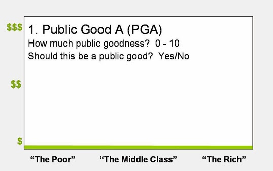
1. PGA - In this case there's not much depth (people didn't contribute much) but perfect breadth (everybody contributed). Every single citizen contributed the same exact amount of money to this public good. Let's say the amount is $5 dollars. Of course, $5 to the poorest person doesn't mean the same thing as $5 to the richest person. This is the logic behind the progressive tax...
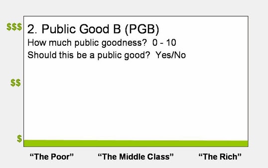
2. PGB - Another straight line. But, it's twice as high on the y-axis. So rather than everybody contributing $5...everybody contributes $10.
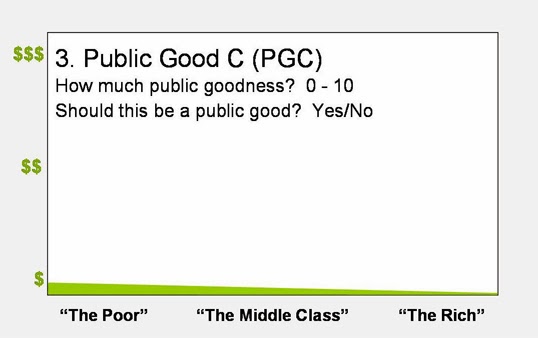
3. PGC - Uneven depth but great breadth. Everybody demands this public good...but income and demand for this good are inversely correlated.
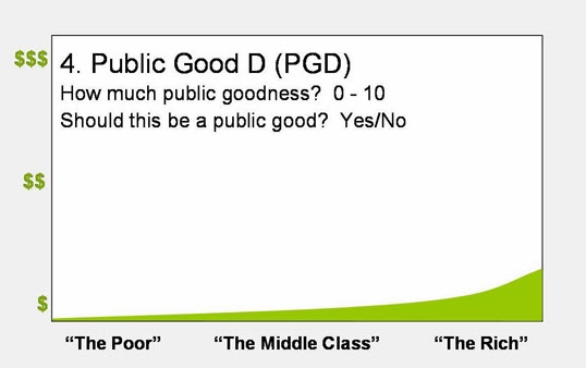
4. PGD - Lousy depth but great breadth.
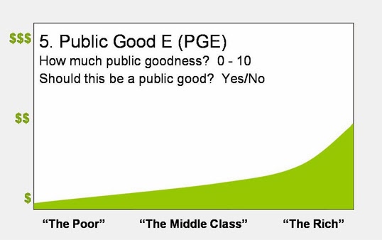
5. PGE - Good depth and great breadth.
Turns out that this forum only allows a maximum of 5 images per thread. So to complete the survey you'll have to see my blog entry... Visualizing And Evaluating The Public Goodness Threshold.
Can you think of other likely demand shapes? Would any public goods match any of these shapes? If anybody would like to create and share their own shapes...just PM me your e-mail address and I'll send you the PowerPoint document.
It stands to reason that if there wasn't enough demand for a public good...then perhaps it shouldn't be a public good. In order to determine where the public goodness threshold might be...I've created a survey.
This public goodness survey consists of 10 different hypothetical public goods. Each public good has its own chart which shows a different demand shape.
To participate in the survey simply rate each public good from 0 to 10...
0 = no depth/breadth = no public goodness
10 = maximum depth/breadth = maximum public goodness
...and indicate whether or not it should be a public good.
For backstory and analysis...please my blog entry... Visualizing And Evaluating The Public Goodness Threshold.
1. PGA - In this case there's not much depth (people didn't contribute much) but perfect breadth (everybody contributed). Every single citizen contributed the same exact amount of money to this public good. Let's say the amount is $5 dollars. Of course, $5 to the poorest person doesn't mean the same thing as $5 to the richest person. This is the logic behind the progressive tax...
So what does PGA's chart tell us? It tells us that everybody demands this good. But income and demand for this good are inversely correlated. The more money you make, the less accurately this good matches your preferences.Economics can establish that a man’s marginal utility of money diminishes as his money-income increases. Therefore, they concluded, the marginal utility of a dollar is less to a rich man than to a poor man. Other things being equal, social utility is maximized by a progressive income tax which takes from the rich and gives to the poor. This was the favorite demonstration of the “old welfare economics,” grounded on Benthamite utilitarian ethics, and brought to fruition by Edgeworth and Pigou. - Murray Rothbard, Toward a Reconstruction of Utility and Welfare Economics
2. PGB - Another straight line. But, it's twice as high on the y-axis. So rather than everybody contributing $5...everybody contributes $10.
3. PGC - Uneven depth but great breadth. Everybody demands this public good...but income and demand for this good are inversely correlated.
4. PGD - Lousy depth but great breadth.
5. PGE - Good depth and great breadth.
Turns out that this forum only allows a maximum of 5 images per thread. So to complete the survey you'll have to see my blog entry... Visualizing And Evaluating The Public Goodness Threshold.
Can you think of other likely demand shapes? Would any public goods match any of these shapes? If anybody would like to create and share their own shapes...just PM me your e-mail address and I'll send you the PowerPoint document.
") Xerographica is describing public goodness surveys for selection of goods and services, true? My concept is same just in the first part, there are public goodness surveys, but I would like to predict what is the best method for selection of decision-makers and their decision-method (not goods). So, I may be out of topic (depends on what is the essential part of this thread
Xerographica is describing public goodness surveys for selection of goods and services, true? My concept is same just in the first part, there are public goodness surveys, but I would like to predict what is the best method for selection of decision-makers and their decision-method (not goods). So, I may be out of topic (depends on what is the essential part of this thread