• This is a political forum that is non-biased/non-partisan and treats every person's position on topics equally. This debate forum is not aligned to any political party. In today's politics, many ideas are split between and even within all the political parties. Often we find ourselves agreeing on one platform but some topics break our mold. We are here to discuss them in a civil political debate. If this is your first visit to our political forums, be sure to check out the RULES. Registering for debate politics is necessary before posting. Register today to participate - it's free!

Daily Statistical Summary of COVID-19

If Trump and his supporters wore their masks, there might be fewer deaths due to Covid-19.

Maybe Trump and his supporters should be charged with involuntary manslaughter for ignoring CDC recommendations.

Interesting point.

Why not start a thread about it?
 
=================================================

GENERAL ADVICE FOR DEALING WITH COVID-19

The best advice anyone can give you is

00 B3 - Dont Panic.webp

TAKE IT!

AND


..............\|||/ .............
..............
(0 o) ..............
......
,-------ooO-----------,....
......
|…...PLEASE ........| ...
.........
| ..DON'T FEED ...| ......
…......
| .THE TROLLS ...| .......
.....
'--------------Ooo----'....
.............
|__|__| .............
..............
|| ||..............
.............
ooO Ooo.............
==============================================================
 
GENERAL NOTES

If you have any dispute/discussion regarding the statistics, please feel free to link back to the latest post in the NEW THREAD that you start so that we can debate what your dispute/discussion is.

DATA SOURCE - COVID-19 Coronavirus Pandemic (at aprox. 1400 Z the day of posting) except where noted.​

NOTE 1 –

“Mortality Rate (All)” appears to bear a one to one correlation to “[Mortality Rate (Closed)] x [Clearance Rate]”. That means that it is likely that the _real_ mortality rate is the “Mortality Rate (Closed)” and only the differing lengths of time from diagnosis to death is obscuring that.​

NOTE 2 –

Chinese figures are not accepted as reliable at this time. However they do not appear to be outside the parameters of countries with equivalent “Asian” population percentages.

US figures are not accepted as reliable at this time. However they do not appear to be outside the parameters of countries with equivalent “Racial” population percentages.​

NOTE 3 –

The Mortality Index chart has been moved to “Block 5” and is being replaced by a chart showing the “7 Day Average New US Cases” and “10 Day Average of 7 Day Averages”. The second measure produces a “cleaner” curve, but is somewhat “sluggish”.​

SPECIAL EXPLANATORY NOTE 4 FOR GRADUATES OF “PIOOYA STATISTICS” CLASSES TAUGHT BY INNUMERATE DOLTS (who probably have a BA [Pla-Doh], a BS [Statistics], and a PhD [Finger Painting] from the University of Numerology)

  1. All charts employ a 30 day forward projection. (Thanks to “Jay59” for the upgrading suggestion.)
    *
  2. Further suggestions to improve the accuracy of the PROJECTIONS are welcomed. “I don’t like the data or what generally accepted mathematical formulae say about the data – so you are full of crap.” comments will be ignored.
    *
  3. Reported deaths normally take dips on weekends (which means the Sunday and Monday numbers are lower than the actual numbers of deaths and the Tuesday and Wednesday numbers are higher),
    *
  4. Reported deaths normally take dips around “emotionally significant dates” (sometimes known as “The ‘Christmas’ Effect” or “The ‘Birthday’ Effect”).
    *
  5. The trend lines are based on actual current and past data and are footed on the assumption that the conditions current as of the generation of the chart do not change.
    *
  6. IF those conditions do change THEN the trend lines WILL change. This, unlike what some dolt will tell you, does NOT mean that the trend lines were wrong when calculated.
    *
  7. Simply pulling numbers out of your butt or cherry-picking data, the way that some dolts do, and then using those PIOOYA numbers to claim expertise just doesn’t hack it in the real world (well, outside of 1600 Pennsylvania Avenue, Washington DC it doesn’t).

NOTE 5 – SPECIAL NOTES REGARDING TABLES AND GRAPHS CONCERNING U.S. STATES

  1. There are a whole lot of posts comparing "State X" against "States A, B, and C" without any acknowledgement that there are actually 50 states. (This is known as "cherry picking data".)
    *
  2. The determination of which states are "Red" and which states are "Blue" is made by Vaughn's Summaries and is based on the 2016 election results.
    *
  3. The totals are lower than the totals on Worldometer because US colonial possessions are excluded and only the actual US states are considered.
    *
  4. Since ALL of the states (and even the District of Columbia) about the only "cherry picking" you can accuse me of doing is leaving out the American colonies of American Samoa, Guam, the Northern Mariana Islands, Puerto Rico, and the US Virgin Islands.

NOTE 6 –

How does the number of tests related to the "Mortality Rate"? It doesn't, and I'm no longer going to be posting that table routinely.​

NOTE 7 –

How does the NATIONAL “Population Density” relate to either the “Infection Rate” or the "Mortality Rate"? It doesn't, (with respect to specified areas inside countries it does, but I simply don’t have the facilities to deal with THAT much nitpicking) and I'm no longer going to be posting that table routinely.​
 
***********************************************

BLOCK 1 - DATA and CORRELATIONS

***********************************************

Compare how the “G-8+China” group, an aggregated “Europe” and an aggregated “World” are doing vis-à-vis each other.

21-01-02 A1 - G8 + CHINA COVID TABLE.webp

***********************************************​

Projections based on the trends current as of the day of posting showing how COVID-19 is likely to progress, its likely total in its first year in the US, and comparing its effect with that of the “Spanish Flu”

21-01-02 A2 - COVID vs Other Causes TABLE.webp

COVID-19 is now the THIRD largest cause of death in the US.

The next "Grim Mortality Milestone” is the psychologically significant number

400,000

IF the current trends continue, THEN this number will be reached on or about 19 JAN 21.

***********************************************​

If you want to see how likely a random person in the “G-8+China” group, an aggregated “Europe” or an aggregated “World” is to die from COVID-19 (which is a combination of the answers to the questions “How likely am I to catch COVID-19?” and “If I do catch COVID-19, then how likely am I to die from it?”) this table shows you. It also shows how well the areas are doing in respect of their (per capita) relative abilities to pay for fighting COVID-19 and with respect to the (per capita) amount that they previously spent on supporting their healthcare systems.

21-01-02 A3 - Comparison of Ratios TABLE.webp
 
***********************************************

BLOCK 2 - DATA

(WITH ARROWS [for the graduates of the BS (Statistics) program at The University of Numerology])

***********************************************

QUICK SUMMARY
OF Comparative COVID-19 (Total Deaths/Total Cases) & Mortality Closed %

- Data source - COVID-19 Coronavirus Pandemic (at aprox. 1400 Z on the date of posting) -

See “General Notes” for caveats as to accuracy of data and “Mortality Rate (Closed)” use.

20/10/10 – World (1,073,673/37,175,477) 3.70% [⇓] / USA (218,685/7,895,738) 4.14% [⇓] / Canada (9,585/178,117) 6.02% [⇓]
20/10/15 – World (1,098,143/38,832,219) 3.63% [⇓] / USA (221,895/8,156,124) 4.03% [⇓] / Canada (9,664/189,387) 5.72% [⇓]
20/10/20 – World (1,124,519/40,749,872) 3.57% [⇓] / USA (225,269/8,459,967) 3.93% [⇓] / Canada (9,778/201,437) 5.45% [⇓]
20/10/25 – World (1,156,181/43,055,448) 3.51% [⇓] / USA (230,086/8,831,449) 3.85% [⇓] / Canada (9,922/213,959) 5.23% [⇓]
20/10/30 – World (1,188,262/45,475,853) 3.47% [⇓] / USA (234,218/9,521,474) 3.77% [⇓] / Canada (10,074/228,542) 5.00% [⇓]
20/11/05 – World (1,233,212/48,588,813) 3.42% [⇓] / USA (239,842/9,802,374) 3.67% [⇓] / Canada (10,331/247,703) 4.78% [⇓]
20/11/10 – World (1,271,398/51,359,570) 3.40% [↭] / USA (244,449/10,422,026) 3.60% [⇓] / Canada (10,564/268,735) 4.61% [⇓]
20/11/15 – World (1,320,932/54,506,572) 3.36% [⇓] / USA (251,285/11,235,666) 3.52% [⇓] / Canada (10,891/291,931) 4.47% [⇓]
20/11/20 – World (1,368,622/57,394,073) 3.32% [↭] / USA (258,363/12,075,243) 3.44% [⇓] / Canada (11,265/315,754) 4.27% [⇓]
20/11/25 – World (1,417,896/60,242,064) 3.29% [↭] / USA (265,986/12,958,805) 3.36% [⇓] / Canada (11,618/342,444) 4.08% [⇓]
20/11/30 – World (1,467,511/63,199,555) 3.25% [⇓] / USA (273,126/13,753,146) 3.26% [⇓] / Canada (12,032/307,278) 3.93% [⇓]
20/12/05 – World (1,527,740/66,408,088) 3.22% [↭] / USA (285,786/14,784,826) 3.19% [⇓] / Canada (12,496/402,569) 3.76% [⇓]
20/12/10 – World (1,579,100/69,418,464) 3.17% [⇓] / USA (296,836/15,829,017) 3.11% [⇓] / Canada (12,983/435,330) 3.58% [⇓]
20/12/15 – World (1,631,067/73,337,911) 3.07% [⇓] / USA (308,091/16,943,897) 3.02% [⇓] / Canada (13,553/468,862) 3.45% [⇓]
20/12/20 – World (1,694,129/76,728,477) 3.05% [⇓] / USA (323,404/18,078,925) 2.98% [⇓] / Canada (14,154/501,594) 3.33% [⇓]
20/12/23 – World (1,722,190/78,302,263) 3.03% [⇓] / USA (330,864/18,688,529) 2.93% [⇓] / Canada (14,425/521,509) 3.23% [⇓]
20/12/24 – World (1,740,719/79,206,175) 3.02% [⇓] / USA (334,239/18,919,461) 2.92% [⇓] / Canada (14,597/528,354) 3.22% [⇓]
20/12/25 – World (1,751,877/79,864,734) 3.02% [↭] / USA (337,075/19,113,266) 2.92% [↭] / Canada (14,719/535,212) 3.21% [⇓]
20/12/26 – World (1,759,690/80,306,622) 3.02% [↭] / USA (338,283/19,212,044) 2.92% [↭] / Canada (14,719/535,213) 3.21% [↭]
20/12/27 – World (1,766,603/80,799,040) 3.01% [⇓] / USA (339,921/19,433,847) 2.89% [⇓] / Canada (14,800/541,616) 3.20% [⇓]
20/12/28 - World (1,774,492/81,273,119) 3.00% [⇓] / USA (341,196/19,580,713) 2.88% [⇓] / Canada (14,963/552,020) 3.17% [⇓]
20/12/29 – World (1,785,004/81,842,364) 2.99% [⇓] / USA (343,270/19,793,361) 2.85% [⇓] / Canada (15,121/555,207) 3.14% [⇓]
20/12/30 – World (1,800,115/82,477,841) 2.99% [↭] / USA (346,604/19,979,759) 2.84% [⇓] / Canada (15,378/565,506) 3.12% [⇓]
20/12/31 – World (1,815,260/83,206,321) 2.98% [⇓] / USA (350,778/20,216,991) 2.84% [↭] / Canada (15,472/572,982) 3.09% [⇓]
21/01/01 – World (1,829,613/84,040,769) 2.98% [↭] / USA (354,381/20,462,501) 2.84% [↭] / Canada (15,606/581,395) 3.09% [↭]
21/01/02 – World (1,838,448/84,564,179) 2.98% [↭] / USA (356,450/20,619,032) 2.84% [↭] / Canada (15,606/582,697) 3.09% [↭]

***********************************************​

The “Rolling 7 day US average deaths per day” TODAY is 2,595 (YESTERDAY it was 2,471).

The US, the 10 day average of the “Rolling 7 day US average deaths per day” is BELOW 2,600.

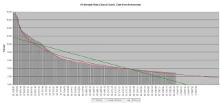
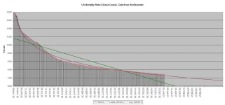
The US mortality rate for CLOSED cases is still dropping.

21-01-02 B1 - Mortality Rate CLOSED GRAPH.webp

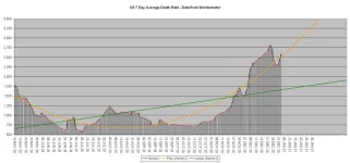
The number of deaths per day data has returned to acting “normally”.

21-01-02 B2 - US Daily Deaths.webp

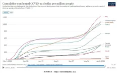
How are the major nations coping? This chart, from Our World in Data

21-01-02 B3 - Our World in Data CDC G-8 plus China GRAPH.webp

illustrates the relative growth rates of COVID-19 in those areas.

Europe IS in the midst of "The Second Wave" of COVID-19. Is the US in a "(First?) Second (Third?) Wave"? See the next block and draw your own conclusions.
 
***********************************************

BLOCK 3 – TODAY’S “WAVE(?)”CHARTS

***********************************************


Today’s charts are based on Worldometer data as of approximately 1400 Z on the day of posting)

21-01-02 C1 - 7 Day Average GRAPH.webp

The rolling "7 Day Average" death rate is now higher than it has been since the beginning of May (shortly after Mr. Trump announced that COVID-19 would "vanish in a couple of weeks”).

21-01-02 C2 - 10 Day Average of Averages GRAPH.webp

The rolling "10 Day Average of the 7 Day Averages" (which gives a much "cleaner" charting) death rate is now higher than it has been since the beginning of May (shortly after Mr. Trump announced that COVID-19 would "vanish in a couple of weeks").

21-01-02 C3 - Daily NEW Case Averages.webp

The "New Cases per Day" numbers may be unreliable due to the combined effect of a weekend and “The Christmas Effect”. This might last into the new year. The daily average of new cases for the past 30 days is 209,538, for the past 10 days it is 193,050, and for the past five days it is 207,664.

Is this the “Second Wave” or the "Third Wave"? Will there be another? Will the US simply continue its (essentially) straight line path without leveling until the pandemic crests and crashes? Draw your own conclusions from the charts and the facts NOT from the latest version of the currently operative, officially sanctioned, "Team Trump" approved, White House issued, truth-of-the-day as delivered by the -ONAN- (oops, sorry, that's) OANN people.
 
***********************************************

BLOCK 4A – US States DATA and CORRELATIONS

IN TABLES

***********************************************


HOW IS YOUR STATE DOING?

All base data is from Worldometer as of ~1400 on the date of posting.

NOTE – 1

The Oregon, Delaware, and Alaska data for recovered cases are out of date and there is no newer data available. The “Mortality Rate (Closed)” and “Recovered Rate” are unreliable for those states.
*
NOTE – 2

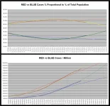
The percentage [top chart at the bottom of the tables] shows how well the “Red States” and “Blue States” are doing in terms of their percentage of the US population. If the “X States” had 50% of the population and 55% of whatever was being measured, then the “X States” would show as 110% while the “Y States” would show as 90%.​

First, the table sorted by "Blue States" (listed by "Mortality Rate [Closed]") and "Red States" (listed by "Mortality Rate [Closed]")

21-01-02 D1a - Red vs Blue - States by Color Sort TABLE.webp

And then sorted by “Cases per Million”

21-01-02 D1b - Red vs Blue - Cases TABLE.webp

And then sorted by “Deaths per Million”

21-01-02 D1c - Red vs Blue - Deaths TABLE.webp

Those are OK if you want to look up specific numbers, but, because they are “single data point” tables, they don’t actually show you what is happening over time. For that, see the next block..
 
***********************************************

BLOCK 4B – US States DATA and CORRELATIONS

IN CHARTS

***********************************************


HOW ARE THE "RED" AND "BLUE" STATES DOING?

As you can see from the "Summary" table, BOTH the "Red States" and the "Blue States" have now moved into the blue "±5% of Average" zone on the "Deaths per Million" column. The "Red States" have moved into that zone from the green "LESS that 95% of Average" zone (for those who still believe that their "expert prediction of 10,300 ABSOLUTE MAXIMUM deaths is accurate, that means that their performance is getting worse)and the "Blue States" have moved into that zone from the red "MORE than 105% of Average" zone (for those who still believe that their "expert prediction of 10,300 ABSOLUTE MAXIMUM deaths is accurate, that means that their performance is getting better).

The “Red States” relative percentage of deaths has now moved from the (better than 5% less than the National Average) “Green Zone” and into the (±5% of National Average) “Blue Zone.

21-01-02 D2a - Red vs Blue - States by Color Sort Summary TABLE.webp

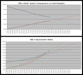
The situation with respect to “Cases per Million” continues NOT to be “happy making”. In fact, NO STATE has a “Cases per Million” rate that is lower than the world average.

The "Red States" increase in "Cases per Million" continues at a faster pace than that of the "Blue States".

21-01-02 D2b - Red vs Blue - Cases CHART.webp

As far as “Deaths per Million” goes, the “Blue States” and the “Red States” are still battling it out to see which can win the "I can kill more of my people than you can" title. However, it appears that the "Red States" are pulling ahead.

21-01-02 D2c - Red vs Blue - Deaths CHART.webp
 
***********************************************

BLOCK 5 – US States DATA and CORRELATIONS

Mortality Measures

***********************************************

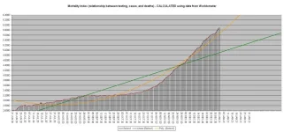
The “Mortality Index” continues to climb. That indicates that the number of deaths is increasing faster than the number of tests so you cannot blame the increase in deaths on the increase in tests.

21-01-02 E1 - Mortality Index CHART.webp

In table format, here is how the individual states are doing

21-01-02 E2 - Red vs Blue - Mortality TABLE.webp

And to give an overview of how the “Red States” and “Blue States” are doing here is that data reduces to a chart.

21-01-02 E3 - Red vs Blue - Mortality CHART.webp
 
***********************************************

BLOCK 6 – THE “TOP 20”s

***********************************************

Of the 20 countries with the highest number of TOTAL cases, the US, with around 10.17% of the total population of the group, has around 30.73% of the total cases for the group. This is roughly 3.02 times its proportional share.

21-01-02 F1 - Worldometer TOP TOTAL Cases TABLE.webp

Of the 20 countries with the highest number of currently ACTIVE cases, the US, with around 10.98% of the total population of the group, has around 51.38% of the total cases for the group. This is roughly 4.68 times its proportional share.

21-01-02 F2 - Worldometer TOP Active Cases TABLE.webp

Extracted from Worldometer, here is the list of the 20 countries with the highest number of COVID-19 “Deaths per Million”

21-01-02 F3 - Worldometer TOP Deaths per Million TABLE.webp

That table shows that those people who are panic mongering and claiming that the US has the world’s highest COVID-19 death rate either simply don’t know what they are talking about or are deliberately attempting to spread false information.

As you can plainly see, <SARC> from that table, all of the countries with higher “Deaths per Million” counts than the US has have “Universal Healthcare Insurance” programs and that is definitive proof that “Universal Healthcare Insurance” programs are ineffective and result in the deaths of millions because of their reliance on Death Panels to ration healthcare (unlike the US where you get all the healthcare that you can pay for out of your own pocket) </SARC>.
 
***********************************************

BLOCK 7 – US States DATA and CORRELATIONS

Mortality Measures

***********************************************

The fact that the total number of US deaths continues to rise isn’t going to surprise anyone other than Dr. Mashmont who jusknowz that the ABSOLUTE MAXIMUM number of COVID-19 deaths peaked out at 10,300 and that there hasn’t been a single COVID-19 death in the US since April 4, 2020.

21-01-02 G1 - Total US Deaths.webp

In the past 24 hours, the US (with approximately 4.26% of the world’s population) has had approximately 23.42% of the world’s COVID-19 deaths. That is a disparity of 5.50 :: 1 which would work out to a “Percentage Grade” of 18.18% (which is an “F”).

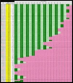
A more easily grasped illustration of what the "Daily Death Rate" is doing in the US is

21-01-02 G2 - The Fading of the Green TABLE.webp
[This table is still being upgraded.]​

Comparing “chance of death” (a combination of “chance of infection” and “mortality rate) to “ability to pay” (PPP GDP per capita) and “previous support for healthcare system” (per capita spending on health care), the data is indicative that the US could have done considerably better than it actually did.

21-01-02 G3b - Death by ABILITY to Pay SHORT TABLE.webp
 
***********************************************

BLOCK 1 - DATA and CORRELATIONS

***********************************************

Compare how the “G-8+China” group, an aggregated “Europe” and an aggregated “World” are doing vis-à-vis each other.

21-01-03 A1 - G8 + CHINA COVID TABLE.webp

***********************************************​

Projections based on the trends current as of the day of posting showing how COVID-19 is likely to progress, its likely total in its first year in the US, and comparing its effect with that of the “Spanish Flu”

21-01-03 A2 - COVID vs Other Causes TABLE.webp

COVID-19 is now the THIRD largest cause of death in the US.

The next "Grim Mortality Milestone” is the psychologically significant number

400,000

IF the current trends continue, THEN this number will be reached on or about [color="RED"18 JAN 21][/color][/size][/b].

[center]***********************************************[/center]

If you want to see how likely a random person in the “G-8+China” group, an aggregated “Europe” or an aggregated “World” is to die from COVID-19 (which is a combination of the answers to the questions “How likely am I to catch COVID-19?” and “If I do catch COVID-19, then how likely am I to die from it?”) this table shows you. It also shows how well the areas are doing in respect of their (per capita) relative abilities to pay for fighting COVID-19 and with respect to the (per capita) amount that they previously spent on supporting their healthcare systems.

[CENTER][ATTACH type="full"]67311374[/ATTACH][/CENTER]
 

Attachments

  • 21-01-03 A3 - Comparison of Ratios TABLE.webp
    21-01-03 A3 - Comparison of Ratios TABLE.webp
    132.5 KB · Views: 0
***********************************************

BLOCK 2 - DATA

(WITH ARROWS [for the graduates of the BS (Statistics) program at The University of Numerology])

***********************************************

QUICK SUMMARY
OF Comparative COVID-19 (Total Deaths/Total Cases) & Mortality Closed %

- Data source - COVID-19 Coronavirus Pandemic (at aprox. 1400 Z on the date of posting) -

See “General Notes” for caveats as to accuracy of data and “Mortality Rate (Closed)” use.

20/10/10 – World (1,073,673/37,175,477) 3.70% [⇓] / USA (218,685/7,895,738) 4.14% [⇓] / Canada (9,585/178,117) 6.02% [⇓]
20/10/15 – World (1,098,143/38,832,219) 3.63% [⇓] / USA (221,895/8,156,124) 4.03% [⇓] / Canada (9,664/189,387) 5.72% [⇓]
20/10/20 – World (1,124,519/40,749,872) 3.57% [⇓] / USA (225,269/8,459,967) 3.93% [⇓] / Canada (9,778/201,437) 5.45% [⇓]
20/10/25 – World (1,156,181/43,055,448) 3.51% [⇓] / USA (230,086/8,831,449) 3.85% [⇓] / Canada (9,922/213,959) 5.23% [⇓]
20/10/30 – World (1,188,262/45,475,853) 3.47% [⇓] / USA (234,218/9,521,474) 3.77% [⇓] / Canada (10,074/228,542) 5.00% [⇓]
20/11/05 – World (1,233,212/48,588,813) 3.42% [⇓] / USA (239,842/9,802,374) 3.67% [⇓] / Canada (10,331/247,703) 4.78% [⇓]
20/11/10 – World (1,271,398/51,359,570) 3.40% [↭] / USA (244,449/10,422,026) 3.60% [⇓] / Canada (10,564/268,735) 4.61% [⇓]
20/11/15 – World (1,320,932/54,506,572) 3.36% [⇓] / USA (251,285/11,235,666) 3.52% [⇓] / Canada (10,891/291,931) 4.47% [⇓]
20/11/20 – World (1,368,622/57,394,073) 3.32% [↭] / USA (258,363/12,075,243) 3.44% [⇓] / Canada (11,265/315,754) 4.27% [⇓]
20/11/25 – World (1,417,896/60,242,064) 3.29% [↭] / USA (265,986/12,958,805) 3.36% [⇓] / Canada (11,618/342,444) 4.08% [⇓]
20/11/30 – World (1,467,511/63,199,555) 3.25% [⇓] / USA (273,126/13,753,146) 3.26% [⇓] / Canada (12,032/307,278) 3.93% [⇓]
20/12/05 – World (1,527,740/66,408,088) 3.22% [↭] / USA (285,786/14,784,826) 3.19% [⇓] / Canada (12,496/402,569) 3.76% [⇓]
20/12/10 – World (1,579,100/69,418,464) 3.17% [⇓] / USA (296,836/15,829,017) 3.11% [⇓] / Canada (12,983/435,330) 3.58% [⇓]
20/12/15 – World (1,631,067/73,337,911) 3.07% [⇓] / USA (308,091/16,943,897) 3.02% [⇓] / Canada (13,553/468,862) 3.45% [⇓]
20/12/20 – World (1,694,129/76,728,477) 3.05% [⇓] / USA (323,404/18,078,925) 2.98% [⇓] / Canada (14,154/501,594) 3.33% [⇓]
20/12/24 – World (1,740,719/79,206,175) 3.02% [⇓] / USA (334,239/18,919,461) 2.92% [⇓] / Canada (14,597/528,354) 3.22% [⇓]
20/12/25 – World (1,751,877/79,864,734) 3.02% [↭] / USA (337,075/19,113,266) 2.92% [↭] / Canada (14,719/535,212) 3.21% [⇓]
20/12/26 – World (1,759,690/80,306,622) 3.02% [↭] / USA (338,283/19,212,044) 2.92% [↭] / Canada (14,719/535,213) 3.21% [↭]
20/12/27 – World (1,766,603/80,799,040) 3.01% [⇓] / USA (339,921/19,433,847) 2.89% [⇓] / Canada (14,800/541,616) 3.20% [⇓]
20/12/28 - World (1,774,492/81,273,119) 3.00% [⇓] / USA (341,196/19,580,713) 2.88% [⇓] / Canada (14,963/552,020) 3.17% [⇓]
20/12/29 – World (1,785,004/81,842,364) 2.99% [⇓] / USA (343,270/19,793,361) 2.85% [⇓] / Canada (15,121/555,207) 3.14% [⇓]
20/12/30 – World (1,800,115/82,477,841) 2.99% [↭] / USA (346,604/19,979,759) 2.84% [⇓] / Canada (15,378/565,506) 3.12% [⇓]
20/12/31 – World (1,815,260/83,206,321) 2.98% [⇓] / USA (350,778/20,216,991) 2.84% [↭] / Canada (15,472/572,982) 3.09% [⇓]
21/01/01 – World (1,829,613/84,040,769) 2.98% [↭] / USA (354,381/20,462,501) 2.84% [↭] / Canada (15,606/581,395) 3.09% [↭]
21/01/02 – World (1,838,448/84,564,179) 2.98% [↭] / USA (356,450/20,619,032) 2.84% [↭] / Canada (15,606/582,697) 3.09% [↭]
21/01/03 – World (1,845,295/85,059,060) 2.97% [⇓] / USA (358,682/20,904,701) 2.82% [⇓] / Canada (15,715/590,280) 3.08% [⇓]

***********************************************​

The “Rolling 7 day US average deaths per day” TODAY is 2,680 (YESTERDAY it was 2,595).

The US, the 10 day average of the “Rolling 7 day US average deaths per day” is BELOW 2,500.

The US mortality rate for CLOSED cases is still dropping.

21-01-03 B1 - Mortality Rate CLOSED GRAPH.webp

The number of deaths per day data has returned to acting “normally”.

21-01-03 B2 - US Daily Deaths.webp

How are the major nations coping? This chart, from Our World in Data

21-01-03 B3 - Our World in Data CDC G-8 plus China GRAPH.webp

illustrates the relative growth rates of COVID-19 in those areas.

Europe IS in the midst of "The Second Wave" of COVID-19. Is the US in a "(First?) Second (Third?) Wave"? See the next block and draw your own conclusions.
 
***********************************************

BLOCK 3 – TODAY’S “WAVE(?)”CHARTS

***********************************************


Today’s charts are based on Worldometer data as of approximately 1400 Z on the day of posting)

21-01-03 C1 - 7 Day Average GRAPH.webp

The rolling "7 Day Average" death rate is now higher than it has been since the beginning of May (shortly after Mr. Trump announced that COVID-19 would "vanish in a couple of weeks”).

21-01-03 C2 - 10 Day Average of Averages GRAPH.webp

The rolling "10 Day Average of the 7 Day Averages" (which gives a much "cleaner" charting) death rate is now higher than it has been since the beginning of May (shortly after Mr. Trump announced that COVID-19 would "vanish in a couple of weeks").

21-01-03 C3 - Daily NEW Case Averages.webp

The "New Cases per Day" numbers may be unreliable due to the combined effect of a weekend and “The Christmas Effect”. This might last into the new year. The daily average of new cases for the past 30 days is 212,089, for the past 10 days it is 198,524, and for the past five days it is 222,268.

Is this the “Second Wave” or the "Third Wave"? Will there be another? Will the US simply continue its (essentially) straight line path without leveling until the pandemic crests and crashes? Draw your own conclusions from the charts and the facts NOT from the latest version of the currently operative, officially sanctioned, "Team Trump" approved, White House issued, truth-of-the-day as delivered by the -ONAN- (oops, sorry, that's) OANN people.
 
***********************************************

BLOCK 4A – US States DATA and CORRELATIONS

IN TABLES

***********************************************


HOW IS YOUR STATE DOING?

All base data is from Worldometer as of ~1400 on the date of posting.

NOTE – 1

The Oregon, Delaware, and Alaska data for recovered cases are out of date and there is no newer data available. The “Mortality Rate (Closed)” and “Recovered Rate” are unreliable for those states.
*
NOTE – 2

The percentage [top chart at the bottom of the tables] shows how well the “Red States” and “Blue States” are doing in terms of their percentage of the US population. If the “X States” had 50% of the population and 55% of whatever was being measured, then the “X States” would show as 110% while the “Y States” would show as 90%.​

First, the table sorted by "Blue States" (listed by "Mortality Rate [Closed]") and "Red States" (listed by "Mortality Rate [Closed]")

21-01-03 D1a - Red vs Blue - States by Color Sort TABLE.webp

And then sorted by “Cases per Million”

21-01-03 D1b - Red vs Blue - Cases TABLE.webp

And then sorted by “Deaths per Million”

21-01-03 D1c - Red vs Blue - Deaths TABLE.webp

Those are OK if you want to look up specific numbers, but, because they are “single data point” tables, they don’t actually show you what is happening over time. For that, see the next block..
 
***********************************************

BLOCK 4B – US States DATA and CORRELATIONS

IN CHARTS

***********************************************


HOW ARE THE "RED" AND "BLUE" STATES DOING?

As you can see from the "Summary" table, BOTH the "Red States" and the "Blue States" have now moved into the blue "±5% of Average" zone on the "Deaths per Million" column. The "Red States" have moved into that zone from the green "LESS that 95% of Average" zone (for those who still believe that their "expert prediction of 10,300 ABSOLUTE MAXIMUM deaths is accurate, that means that their performance is getting worse)and the "Blue States" have moved into that zone from the red "MORE than 105% of Average" zone (for those who still believe that their "expert prediction of 10,300 ABSOLUTE MAXIMUM deaths is accurate, that means that their performance is getting better).

The “Red States” relative percentage of deaths has now moved from the (better than 5% less than the National Average) “Green Zone” and into the (±5% of National Average) “Blue Zone. There is a strong likelihood (assuming that nothing changes) that the "Blue States" numbers for "Percentage of Deaths" will move out of the "Red Zone" (5+% above average) and into the "Blue Zone" (±5% of average) within a week.

21-01-03 D2a - Red vs Blue - States by Color Sort Summary TABLE.webp

The situation with respect to “Cases per Million” continues NOT to be “happy making”. In fact, NO STATE has a “Cases per Million” rate that is lower than the world average.

The "Red States" increase in "Cases per Million" continues at a faster pace than that of the "Blue States".

21-01-03 D2b - Red vs Blue - Cases CHART.webp

As far as “Deaths per Million” goes, the “Blue States” and the “Red States” are still battling it out to see which can win the "I can kill more of my people than you can" title.

21-01-03 D2c - Red vs Blue - Deaths CHART.webp
 
***********************************************

BLOCK 5 – US States DATA and CORRELATIONS

Mortality Measures

***********************************************

The “Mortality Index” continues to climb. That indicates that the number of deaths is increasing faster than the number of tests so you cannot blame the increase in deaths on the increase in tests.

21-01-03 E1 - Mortality Index CHART.webp

In table format, here is how the individual states are doing

21-01-03 E2 - Red vs Blue - Mortality TABLE.webp

And to give an overview of how the “Red States” and “Blue States” are doing here is that data reduces to a chart.

21-01-03 E3 - Red vs Blue - Mortality CHART.webp
 
***********************************************

BLOCK 6 – THE “TOP 20”s

***********************************************

Of the 20 countries with the highest number of TOTAL cases, the US, with around 10.17% of the total population of the group, has around 30.94% of the total cases for the group. This is roughly 3.04 times its proportional share.

21-01-03 F1 - Worldometer TOP TOTAL Cases TABLE.webp

Of the 20 countries with the highest number of currently ACTIVE cases, the US, with around 10.98% of the total population of the group, has around 51.67% of the total cases for the group. This is roughly 4.71 times its proportional share.

21-01-03 F2 - Worldometer TOP Active Cases TABLE.webp

Extracted from Worldometer, here is the list of the 20 countries with the highest number of COVID-19 “Deaths per Million”

21-01-03 F3 - Worldometer TOP Deaths per Million TABLE.webp

That table shows that those people who are panic mongering and claiming that the US has the world’s highest COVID-19 death rate either simply don’t know what they are talking about or are deliberately attempting to spread false information.

As you can plainly see, <SARC> from that table, all of the countries with higher “Deaths per Million” counts than the US has have “Universal Healthcare Insurance” programs and that is definitive proof that “Universal Healthcare Insurance” programs are ineffective and result in the deaths of millions because of their reliance on Death Panels to ration healthcare (unlike the US where you get all the healthcare that you can pay for out of your own pocket) </SARC>.
 
***********************************************

BLOCK 7 – US States DATA and CORRELATIONS

Mortality Measures

***********************************************

The fact that the total number of US deaths continues to rise isn’t going to surprise anyone other than Dr. Mashmont who jusknowz that the ABSOLUTE MAXIMUM number of COVID-19 deaths peaked out at 10,300 and that there hasn’t been a single COVID-19 death in the US since April 4, 2020.

21-01-03 G1 - Total US Deaths.webp

In the past 24 hours, the US (with approximately 4.26% of the world’s population) has had approximately 24.58% of the world’s COVID-19 deaths. That is a disparity of 5.77 :: 1 (which is a “Percentage Grade” of 17.32%). It also has 19.44% of the world’s COVID-19 deaths, which is a disparity of 4.57 :: 1 (which is a “Percentage Grade” of 21.90%). Each of those “Percentage Grades” is an “F”

A more easily grasped illustration of what the "Daily Death Rate" is doing in the US is

21-01-03 G2 - The Fading of the Green TABLE.webp

Comparing “chance of death” (a combination of “chance of infection” and “mortality rate) to “ability to pay” (PPP GDP per capita) and “previous support for healthcare system” (per capita spending on health care), the data is indicative that the US could have done considerably better than it actually did.

21-01-03 G3b - Death by ABILITY to Pay SHORT TABLE.webp
With 25 out of 27 (92.59%) [22 out of 24 {91.67%} if you don't count China] of those measures being at least 5% better than the US, it's difficult to say that America is doing as well as it should have done in fighting COVID-19
 
***********************************************

BLOCK 1 - DATA and CORRELATIONS

***********************************************

Compare how the “G-8+China” group, an aggregated “Europe” and an aggregated “World” are doing vis-à-vis each other.

21-01-04 A1 - G8 + CHINA COVID TABLE.webp

***********************************************​

Projections based on the trends current as of the day of posting showing how COVID-19 is likely to progress, its likely total in its first year in the US, and comparing its effect with that of the “Spanish Flu”

21-01-04 A2 - COVID vs Other Causes TABLE.webp

COVID-19 is now the THIRD largest cause of death in the US.

The next "Grim Mortality Milestone” is the psychologically significant number

400,000

IF the current trends continue, THEN this number will be reached on or about 18 JAN 21.

***********************************************​

If you want to see how likely a random person in the “G-8+China” group, an aggregated “Europe” or an aggregated “World” is to die from COVID-19 (which is a combination of the answers to the questions “How likely am I to catch COVID-19?” and “If I do catch COVID-19, then how likely am I to die from it?”) this table shows you. It also shows how well the areas are doing in respect of their (per capita) relative abilities to pay for fighting COVID-19 and with respect to the (per capita) amount that they previously spent on supporting their healthcare systems.

21-01-04 A3 - Comparison of Ratios TABLE.webp
 
***********************************************

BLOCK 2 - DATA

(WITH ARROWS [for the graduates of the BS (Statistics) program at The University of Numerology])

***********************************************

QUICK SUMMARY
OF Comparative COVID-19 (Total Deaths/Total Cases) & Mortality Closed %

- Data source - COVID-19 Coronavirus Pandemic (at aprox. 1400 Z on the date of posting) -

See “General Notes” for caveats as to accuracy of data and “Mortality Rate (Closed)” use.

20/10/10 – World (1,073,673/37,175,477) 3.70% [⇓] / USA (218,685/7,895,738) 4.14% [⇓] / Canada (9,585/178,117) 6.02% [⇓]
20/10/15 – World (1,098,143/38,832,219) 3.63% [⇓] / USA (221,895/8,156,124) 4.03% [⇓] / Canada (9,664/189,387) 5.72% [⇓]
20/10/20 – World (1,124,519/40,749,872) 3.57% [⇓] / USA (225,269/8,459,967) 3.93% [⇓] / Canada (9,778/201,437) 5.45% [⇓]
20/10/25 – World (1,156,181/43,055,448) 3.51% [⇓] / USA (230,086/8,831,449) 3.85% [⇓] / Canada (9,922/213,959) 5.23% [⇓]
20/10/30 – World (1,188,262/45,475,853) 3.47% [⇓] / USA (234,218/9,521,474) 3.77% [⇓] / Canada (10,074/228,542) 5.00% [⇓]
20/11/05 – World (1,233,212/48,588,813) 3.42% [⇓] / USA (239,842/9,802,374) 3.67% [⇓] / Canada (10,331/247,703) 4.78% [⇓]
20/11/10 – World (1,271,398/51,359,570) 3.40% [↭] / USA (244,449/10,422,026) 3.60% [⇓] / Canada (10,564/268,735) 4.61% [⇓]
20/11/15 – World (1,320,932/54,506,572) 3.36% [⇓] / USA (251,285/11,235,666) 3.52% [⇓] / Canada (10,891/291,931) 4.47% [⇓]
20/11/20 – World (1,368,622/57,394,073) 3.32% [↭] / USA (258,363/12,075,243) 3.44% [⇓] / Canada (11,265/315,754) 4.27% [⇓]
20/11/25 – World (1,417,896/60,242,064) 3.29% [↭] / USA (265,986/12,958,805) 3.36% [⇓] / Canada (11,618/342,444) 4.08% [⇓]
20/11/30 – World (1,467,511/63,199,555) 3.25% [⇓] / USA (273,126/13,753,146) 3.26% [⇓] / Canada (12,032/307,278) 3.93% [⇓]
20/12/05 – World (1,527,740/66,408,088) 3.22% [↭] / USA (285,786/14,784,826) 3.19% [⇓] / Canada (12,496/402,569) 3.76% [⇓]
20/12/10 – World (1,579,100/69,418,464) 3.17% [⇓] / USA (296,836/15,829,017) 3.11% [⇓] / Canada (12,983/435,330) 3.58% [⇓]
20/12/15 – World (1,631,067/73,337,911) 3.07% [⇓] / USA (308,091/16,943,897) 3.02% [⇓] / Canada (13,553/468,862) 3.45% [⇓]
20/12/20 – World (1,694,129/76,728,477) 3.05% [⇓] / USA (323,404/18,078,925) 2.98% [⇓] / Canada (14,154/501,594) 3.33% [⇓]
20/12/25 – World (1,751,877/79,864,734) 3.02% [↭] / USA (337,075/19,113,266) 2.92% [↭] / Canada (14,719/535,212) 3.21% [⇓]
20/12/27 – World (1,766,603/80,799,040) 3.01% [⇓] / USA (339,921/19,433,847) 2.89% [⇓] / Canada (14,800/541,616) 3.20% [⇓]
20/12/28 - World (1,774,492/81,273,119) 3.00% [⇓] / USA (341,196/19,580,713) 2.88% [⇓] / Canada (14,963/552,020) 3.17% [⇓]
20/12/29 – World (1,785,004/81,842,364) 2.99% [⇓] / USA (343,270/19,793,361) 2.85% [⇓] / Canada (15,121/555,207) 3.14% [⇓]
20/12/30 – World (1,800,115/82,477,841) 2.99% [↭] / USA (346,604/19,979,759) 2.84% [⇓] / Canada (15,378/565,506) 3.12% [⇓]
20/12/31 – World (1,815,260/83,206,321) 2.98% [⇓] / USA (350,778/20,216,991) 2.84% [↭] / Canada (15,472/572,982) 3.09% [⇓]
21/01/01 – World (1,829,613/84,040,769) 2.98% [↭] / USA (354,381/20,462,501) 2.84% [↭] / Canada (15,606/581,395) 3.09% [↭]
21/01/02 – World (1,838,448/84,564,179) 2.98% [↭] / USA (356,450/20,619,032) 2.84% [↭] / Canada (15,606/582,697) 3.09% [↭]
21/01/03 – World (1,845,295/85,059,060) 2.97% [⇓] / USA (358,682/20,904,701) 2.82% [⇓] / Canada (15,715/590,280) 3.08% [⇓]
21/01/04 – World (1,852,796/85,593,845) 2.97% [↭] / USA (360,078/21,113,528) 2.81% [⇓] / Canada (15,865/601,663) 3.05% [⇓]

***********************************************​

The “Rolling 7 day US average deaths per day” TODAY is 2,697 (YESTERDAY it was 2,680).

The US, the 10 day average of the “Rolling 7 day US average deaths per day” is EXACTLY 2,300.

The US mortality rate for CLOSED cases is still dropping.

21-01-04 B1 - Mortality Rate CLOSED GRAPH.webp

The number of deaths per day data has returned to acting “normally”.

21-01-04 B2 - US Daily Deaths.webp

How are the major nations coping? This chart, from Our World in Data

21-01-04 B3 - Our World in Data CDC G-8 plus China GRAPH.webp

illustrates the relative growth rates of COVID-19 in those areas.

Europe IS in the midst of "The Second Wave" of COVID-19. Is the US in a "(First?) Second (Third?) Wave"? See the next block and draw your own conclusions.
 
***********************************************

BLOCK 3 – TODAY’S “WAVE(?)”CHARTS

***********************************************


Today’s charts are based on Worldometer data as of approximately 1400 Z on the day of posting)

21-01-04 C1 - 7 Day Average GRAPH.webp

The rolling "7 Day Average" death rate is now higher than it has been since the beginning of May (shortly after Mr. Trump announced that COVID-19 would "vanish in a couple of weeks”).

21-01-04 C2 - 10 Day Average of Averages GRAPH.webp

The rolling "10 Day Average of the 7 Day Averages" (which gives a much "cleaner" charting) death rate is now higher than it has been since the beginning of May (shortly after Mr. Trump announced that COVID-19 would "vanish in a couple of weeks").

21-01-04 C3 - Daily NEW Case Averages.webp

The "New Cases per Day" numbers may be unreliable due to the combined effect of a weekend and “The Christmas Effect”. This might last into the new year. The daily average of new cases for the past 30 days is 210,957, for the past 10 days it is 200.026, and for the past five days it is 226,754.

Is this the “Second Wave” or the "Third Wave"? Will there be another? Will the US simply continue its (essentially) straight line path without leveling until the pandemic crests and crashes? Draw your own conclusions from the charts and the facts NOT from the latest version of the currently operative, officially sanctioned, "Team Trump" approved, White House issued, truth-of-the-day as delivered by the -ONAN- (oops, sorry, that's) OANN people.
 
***********************************************

BLOCK 4A – US States DATA and CORRELATIONS

IN TABLES

***********************************************


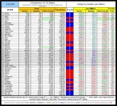
HOW IS YOUR STATE DOING?

All base data is from Worldometer as of ~1400 on the date of posting.

NOTE – 1

The Oregon, Delaware, and Alaska data for recovered cases are out of date and there is no newer data available. The “Mortality Rate (Closed)” and “Recovered Rate” are unreliable for those states.
*
NOTE – 2

The percentage [top chart at the bottom of the tables] shows how well the “Red States” and “Blue States” are doing in terms of their percentage of the US population. If the “X States” had 50% of the population and 55% of whatever was being measured, then the “X States” would show as 110% while the “Y States” would show as 90%.​

First, the table sorted by "Blue States" (listed by "Mortality Rate [Closed]") and "Red States" (listed by "Mortality Rate [Closed]")

21-01-04 D1a - Red vs Blue - States by Color Sort TABLE.webp

And then sorted by “Cases per Million”

21-01-04 D1b - Red vs Blue - Cases TABLE.webp

And then sorted by “Deaths per Million”

21-01-04 D1c - Red vs Blue - Deaths TABLE.webp

Those are OK if you want to look up specific numbers, but, because they are “single data point” tables, they don’t actually show you what is happening over time. For that, see the next block.
 
***********************************************

BLOCK 4B – US States DATA and CORRELATIONS

IN CHARTS

***********************************************


HOW ARE THE "RED" AND "BLUE" STATES DOING?

As you can see from the "Summary" table, BOTH the "Red States" and the "Blue States" have now moved into the blue "±5% of Average" zone on the "Deaths per Million" column. The "Red States" have moved into that zone from the green "LESS that 95% of Average" zone (for those who still believe that their "expert prediction of 10,300 ABSOLUTE MAXIMUM deaths is accurate, that means that their performance is getting worse)and the "Blue States" have moved into that zone from the red "MORE than 105% of Average" zone (for those who still believe that their "expert prediction of 10,300 ABSOLUTE MAXIMUM deaths is accurate, that means that their performance is getting better).

The “Red States” relative percentage of deaths has now moved from the (better than 5% less than the National Average) “Green Zone” and into the (±5% of National Average) “Blue Zone.

21-01-04 D2a - Red vs Blue - States by Color Sort Summary TABLE.webp

The situation with respect to “Cases per Million” continues NOT to be “happy making”. In fact, NO STATE has a “Cases per Million” rate that is lower than the world average.

The "Red States" increase in "Cases per Million" continues at a faster pace than that of the "Blue States".

21-01-04 D2b - Red vs Blue - Cases CHART.webp

As far as “Deaths per Million” goes, the “Blue States” and the “Red States” are still battling it out to see which can win the "I can kill more of my people than you can" title. However the "Red States" have pulled ahead and appear to be increasing their lead.

21-01-04 D2c - Red vs Blue - Deaths CHART.webp
 
***********************************************

BLOCK 5 – US States DATA and CORRELATIONS

Mortality Measures

***********************************************

The “Mortality Index” continues to climb. That indicates that the number of deaths is increasing faster than the number of tests so you cannot blame the increase in deaths on the increase in tests.

21-01-04 E1 - Mortality Index CHART.webp

In table format, here is how the individual states are doing

21-01-04 E2 - Red vs Blue - Mortality TABLE.webp

And to give an overview of how the “Red States” and “Blue States” are doing here is that data reduces to a chart.

21-01-04 E3 - Red vs Blue - Mortality CHART.webp
 
Back
Top Bottom