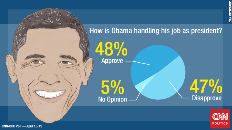
"This" is, in its own ways, a highly misleading way to regard unemployment stats.
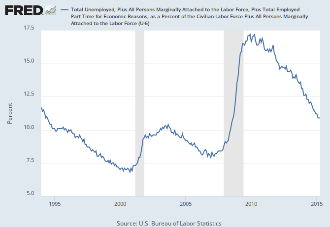
If you're going to take U6 unemployment as your measure, it is deceptive to start using that number in 2008. We can go back to 1994:
What the author labels as an "anemic recovery" is also 5 years of steady reductions in the unemployment rate, from a level far more severe than any recession in recent history.
He also adds in around 7 million people, apparently because he believes that LFPR ought to be at 66%. That seems a bit odd.
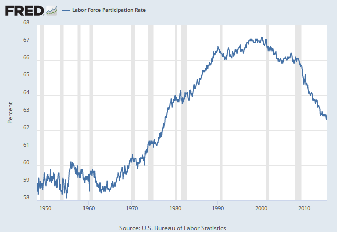
When we're looking at labor force participation rates, we see that LFPR started dropping in
2000, long before the recent recession. He fails to recognize that LFPR is dropping for structural reasons, rather than cyclical ones.
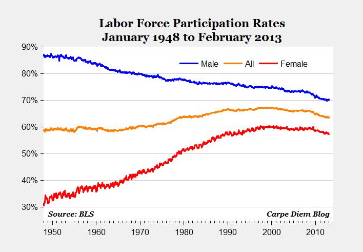
We also see something very curious when we split up LFPR by gender:
Men have been leaving the workforce, and women have been joining the workforce, for
decades. Women basically started leaving the workforce around 2000.
And why
are people out of the workforce? We aren't sure, but it is likely a combination of several factors:
• People are starting to retire
• More people are going to college than ever before
• More parents are staying at home, as it costs more to pay for day care than what their work provides
• And yes, some people are unable to find work
And of course, LFPR leveled off in early 2014. It's too early know if that's a trend.
Anyway. 3 of these are structural, 1 is cyclical. Thus, presuming that LFPR ought to be at near-peak levels, merely because that's where it was at the start of the recession, doesn't make sense.
Last but certainly not least, U3 / U6 and LFPR rates are only part of the picture. As usual, I recommend Yellen's dashboard for a more complete idea of the health of employment in the US:
Yellen's Dashboard