
- Joined
- Apr 18, 2013
- Messages
- 94,171
- Reaction score
- 82,451
- Location
- Barsoom
- Gender
- Male
- Political Leaning
- Independent
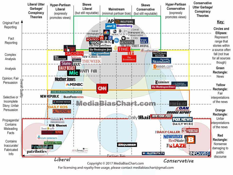
The Chart, Version 3.0: What, Exactly, Are We Reading?
Came across a page with chart-modeling of media bias by patent attorney Vanessa Otero (@vlotero). At the link above, she explains her chart methodology.
Related: The Viral Media Graphic (with special thanks to Vanessa Otero)
Came across a page with chart-modeling of media bias by patent attorney Vanessa Otero (@vlotero). At the link above, she explains her chart methodology.
Related: The Viral Media Graphic (with special thanks to Vanessa Otero)
