- Joined
- Jul 13, 2009
- Messages
- 17,653
- Reaction score
- 12,265
- Location
- State of Jefferson
- Gender
- Male
- Political Leaning
- Moderate
One thing that always amazes people when they look at a traditional map is how big some countries are, like Russia, Greenland, and Canada. And also how small some continents are, like Africa.
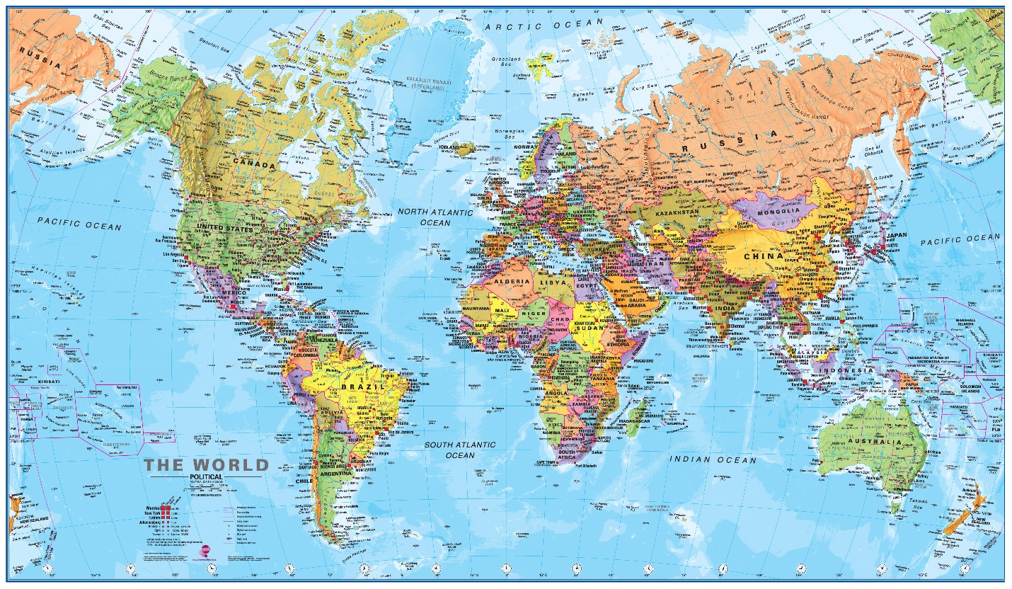
Now how many of you know that is a lie? That the countries and continents you generally see on a map are not drawn to their true size?
This is due to the fact that we live on a globe. And with a N-S axis all such depictions tend to loose their true scales depending upon their location on the globe? Things in reality compress at the poles, and stretch at the equator.

This is actually a much more accurate map, drawn to actual distance scale. Notice how much in this depiction Russia and Greenland become squashed, and how much larger Africa appears.
To see how this works if a part of the world moved, examine Greenland shifting South.

The size of Greenland does not change, simply it's location while keeping it the actual size. Amazing how our perception has been fooling most of us for all of our lives.
Now how many of you know that is a lie? That the countries and continents you generally see on a map are not drawn to their true size?
This is due to the fact that we live on a globe. And with a N-S axis all such depictions tend to loose their true scales depending upon their location on the globe? Things in reality compress at the poles, and stretch at the equator.
This is actually a much more accurate map, drawn to actual distance scale. Notice how much in this depiction Russia and Greenland become squashed, and how much larger Africa appears.
To see how this works if a part of the world moved, examine Greenland shifting South.
The size of Greenland does not change, simply it's location while keeping it the actual size. Amazing how our perception has been fooling most of us for all of our lives.