- Joined
- Jan 28, 2012
- Messages
- 16,386
- Reaction score
- 7,793
- Location
- Where I am now
- Gender
- Male
- Political Leaning
- Independent

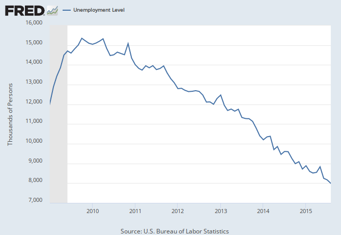
Sure...how come your charts are inconsistent with their dates? Why do some start around 1950, another in '85, another in 2000, and one in 2009?
Sure...how come your charts are inconsistent with their dates? Why do some start around 1950, another in '85, another in 2000, and one in 2009?
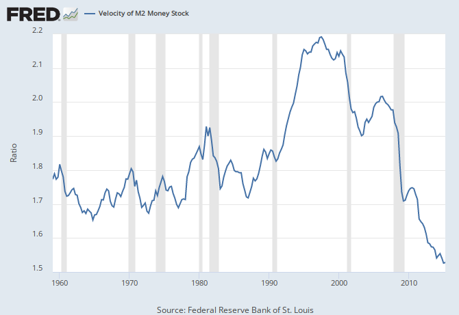
Sure...how come your charts are inconsistent with their dates? Why do some start around 1950, another in '85, another in 2000, and one in 2009?


Thoughts?
Nearly all of the data plots show declining rates BEFORE Obama became POTUS. Since the 2008 Bush recession accelerated the worsening of most of the data, how again are such huge macro changes the fault of Obama?Zero Hedge
Thoughts?
Fine, youre a something that has nothing but contempt for the current POTUS.Once again, I am neither dem nor rep.
Nearly all of the data plots show declining rates BEFORE Obama became POTUS. Since the 2008 Bush recession accelerated the worsening of most of the data, how again are such huge macro changes the fault of Obama?
What part of " declining rates BEFORE Obama became POTUS" did you not get?I also would look for the first cause earlier. In fact, that is in the way Clinton/Greenspan allowed the dot.com bubble build up without doing anything.
Whatever you say...Other things like medical costs he is responsible for making a bad situation worse.
Yes, because by not using a standard set date, the data can (and appears was) easily manipulated to tell any story you wish. For example, why post a graph of student loans which starts in the 1940s? Because then you have a much lower baseline for when student loans began to rise. Why start the labor force participation rate in 2006? Because if you started it back in 1940, you'd see several inclines and declines, with the latest decline starting around the late 90s, early 2000s.Wow! Is that your takeaway? Inconsistent dates on graphs?
Yes, because by not using a standard set date, the data can (and appears was) easily manipulated to tell any story you wish. For example, why post a graph of student loans which starts in the 1940s? Because then you have a much lower baseline for when student loans began to rise. Why start the labor force participation rate in 2006? Because if you started it back in 1940, you'd see several inclines and declines, with the latest decline starting around the late 90s, early 2000s.
This is nothing more than cherry picking data.
What part of " declining rates BEFORE Obama became POTUS" did you not get?
Whatever you say...

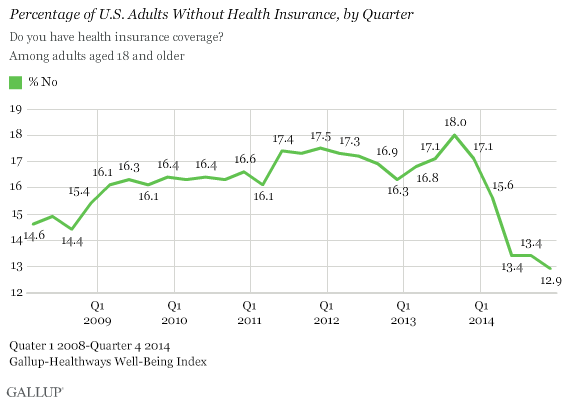
Brad DeLong's Grasping Reality: Economics: Health
Easily remedied by simply looking at the charts from the same starting dates. All of them can be looked at from 2008, except for the Health Insurance Costs. Simply ignore any graph prior to that date. The fault would seem to be with the viewer.
Unless the chart only goes back to 2009. Then you can't see anything before then. Which, of course, is the point of constantly changing graph start dates.Easily remedied by simply looking at the charts from the same starting dates.
But if you did, then the graph doesn't look NEARLY as scary as it does if you include data from decades before. That's the point of cherry picking data. The author of the article clearly had it in mind to present a biased look at current conditions by deliberately manipulating the data to fit the narrative he/she was trying to push.All of them can be looked at from 2008, except for the Health Insurance Costs. Simply ignore any graph prior to that date. The fault would seem to be with the viewer.