- Joined
- Jul 19, 2012
- Messages
- 14,185
- Reaction score
- 8,768
- Location
- Houston
- Gender
- Male
- Political Leaning
- Libertarian
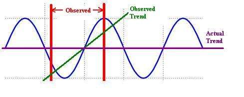
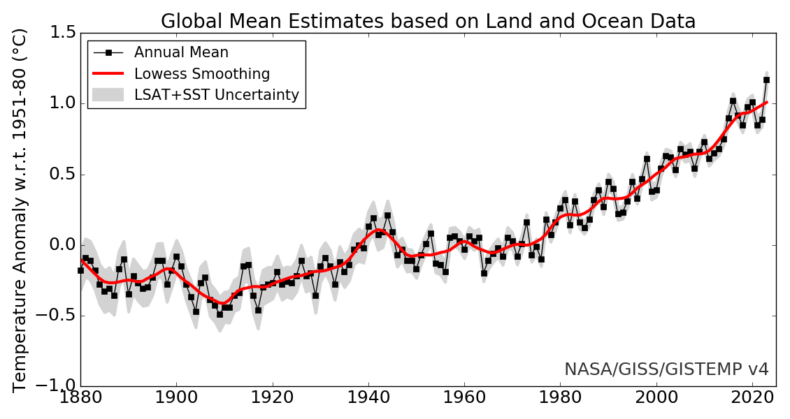
Data from weather stations on the earth's surface are available from 1880 to the present day. According to professional statisticians there is no trend in this data that can properly be distinguished from natural random variation. Multiple statisticians agree with this and have published it, but climate scientists say there's a trend anyway.
This follows a pattern I've seen in other fields of science:
1. Investigator does an experiment and collects data.
2. Investigator takes the data to a statistician, who tells him nothing significant can be concluded from the data.
3. Investigator stops talking to the statistician and publishes the data anyway using improper statistics.
A lot of scientists use statistics computer packages. Data can be fed into these programs and they will produce an answer. What most scientists don't understand is that a statistical method has a whole raft of pre-conditions that have to be true for the answer to be valid.
The key issue with temperature data is that it is time series data. Time series analysis is a whole different field, and there is no evidence that any climate scientists understand it. They all use improper statistics. So where they find a trend in the data there is none.
____________________________
Cowpertwait P.S.P., Metcalfe A.V. (2009), Introductory Time Series with R (Springer).
Shumway R.H., Stoffer D.S. (2011), Time Series Analysis and Its Applications (Springer).


 5)
5)