• This is a political forum that is non-biased/non-partisan and treats every person's position on topics equally. This debate forum is not aligned to any political party. In today's politics, many ideas are split between and even within all the political parties. Often we find ourselves agreeing on one platform but some topics break our mold. We are here to discuss them in a civil political debate. If this is your first visit to our political forums, be sure to check out the RULES. Registering for debate politics is necessary before posting. Register today to participate - it's free!

A couple of simple man questions


How much of the world has been permanently, well OK for 25,000 year, been made uninhabitable by individual little packets of sugar which help reduce waste in sugar?

Why is your threshold "permanently uninhabitable?" Doesn't that strike you as an absolutely ludicrous standard of measurement?
 
This " rapid rise in temperatures" you speak of, is only slightly above the noise level.
The Increase from 1917 to 1944 (before the more significant CO2 level increases)
was .0214 C per year.
The increase from 1976 to 2012 was only .0184 C per year.
Temperature swings before the instrument may have been greater, but the proxies
we have lack resolution.
As to onset of an ice age spanning over a thousand years,
I remember reading about a fourteenth century
alpine village, where they called the priest, to stop the advancing glacier.
The glacier was said to be advancing at a slow walk.

In the first period you mentioned, solar activity rose significantly. In the second period you mentioned, solar activity decreased slightly.
 
In the first period you mentioned, solar activity rose significantly. In the second period you mentioned, solar activity decreased slightly.
I was making a numerical observation, that the increase in temperature, whatever the cause,
was not unprecedented.
 
Quote Originally Posted by Tim the plumber View Post

How much of the world has been permanently, well OK for 25,000 year, been made uninhabitable by individual little packets of sugar which help reduce waste in sugar?

Why is your threshold "permanently uninhabitable?" Doesn't that strike you as an absolutely ludicrous standard of measurement?

Fission has caused lots of places to be permanently uninhabitable. If and when a war wanders over a nation with such plants it will spread the poisonous crap all over the world.

The use of small packets of sugar costs virtually nothing. Why are you complaining about that?
 
I'm a simple guy. I don't have more than 100 college level physics and chemistry. However, over the years I have honed my BS detector. What I would like to know is why does the AGW community base our ideal temps around those found in the 70's? Who's to say that the climate we had a hundred, thousand, million years ago isn't the sweet spot for our planet?

Likely, the "Sweet Spot" has little to do with what works for the Earth, and much to do with what works for human beings....including the folks picking this "Optimal" temperature and climate.
 
This " rapid rise in temperatures" you speak of, is only slightly above the noise level.
The Increase from 1917 to 1944 (before the more significant CO2 level increases)
was .0214 C per year.
The increase from 1976 to 2012 was only .0184 C per year.

Anthropogenic influence may have contributed nearly a third of the warming in that earlier period (eg. forcing estimates by James Hansen and colleages in 2012 and Meehl et al 2004).

More importantly, in the first period the rise in the longer-term trend (eg. 5-year or 10-year mean) began around 1910, not 1917. It was an increase of up to 0.5 degrees over c.35 years. The second period was an increase closer to 0.6 degrees over a similar time-frame (mid 70s to present) - and that, as Deuce has noted, includes declining solar irradiance over the past two cycles (and for that matter some major volcanic effects and increasing aerosole cooling).

Met Office Hadley Centre observations datasets

Wood for Trees: Interactive Graphs
You can slide time scales around to see what you want.
My comment was showing that the rise from 1976 to 2012 was not out of the ordinary.
FYI: The fact that sliding the time scales can alter the result considerably,
is saying the signal to noise ratio are near one to one.
 
I'm a simple guy. I don't have more than 100 college level physics and chemistry. However, over the years I have honed my BS detector. What I would like to know is why does the AGW community base our ideal temps around those found in the 70's? Who's to say that the climate we had a hundred, thousand, million years ago isn't the sweet spot for our planet?

Bear with me for a second on my answer.. it starts out having nothing to do with climate and ends having everything to do with statistical presentation:

I started a thread a few weeks ago regarding the eerily similar curve of the per-Depression Dow Jones in 1928-29 versus the recent Dow Jones performance. The graph follows:

MW-BU310_scary__20140210132547_MG.webp

Many people have attacked this graph, and with some merit, on the grounds that the graph itself amplifies scale of current Dow Jones versus the orders of magnitude inflation of pre-Depression markets as well as compresses the X axis in spots. While this is a fair argument, there was no real prediction of future outcomes in the DJIA. More of a novelty with a hint of scare mixed in.

What does this have to do with your question? Well, simply, all the graphs you might have ever seen comparing global climate to CO2 have been of the anomaly variety for much the same reason as the MarketWatch graph normalizes and amplifies the current DJIA curve in their comparison. The reason? If you don't normalize it the graph stops showing the correlation. For example, here is a temperature graph of Central England using actual whole degrees versus CO2 emissions:

6a010536b58035970c0120a7c87805970b.webp

It just doesn't have the same bite, does it? :lol:
 
Central England isn't even all of England, let alone the globe. (That's what the "G" in AGW stands for.)
 
AGW is about thousands of such local records. Any single one is not significant. That's the real point.
 
GISS data is excellent, but it doesn't go back to the sixteenth century.
 
who said it did, it does go back to 1880, which is where my graph starts.

How much weather monitoring equipment do you think was in place around the world in 1880? And do you think the conditions around the world, especially where that monitoring equipment might have been placed, might have changed as we have added close to 6 billion people to the world population since that time?
 
How much weather monitoring equipment do you think was in place around the world in 1880? And do you think the conditions around the world, especially where that monitoring equipment might have been placed, might have changed as we have added close to 6 billion people to the world population since that time?

The first plot shows coverage in 1885, five years into the GHCN record.


The final plot illustrates the world-wide station coverage used to tell us “2006 Was Earth’s Fifth Warmest Year“.
 
^ It must be intimidating to the alarmists when they get detailed explanations of why their arguments are weak.

Of course that would need them to understand why the maps make them look silly.
 
^ It must be intimidating to the alarmists when they get detailed explanations of why their arguments are weak.

Of course that would need them to understand why the maps make them look silly.

Do you always assume that unreferenced sensationalist claims must necessarily be true? Might that not make you look silly?

According to The Global Historical Climatology Network: Long-Term Monthly Temperature, Precipitation, Sea Level Pressure, and Station Pressure Data (1992), the GHCN project
"contains data from roughly 6000 temperature stations, 7500 precipitation stations, 1800 sea level pressure stations, and 1800 station pressure stations. Each station has at least 10 years of data, 40% have more than 50 years of data. . . .
The earliest station data are from 1697...
"
A 
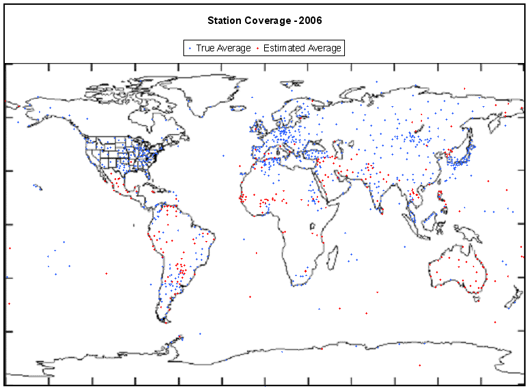
map of their coverage is not quite the same as the three- or four-hundred station map which Code posted.

Code's second map is for 2006 of course. GHCN-monthly version 2 was current from 1997 to 2011, during which period
"GHCN-Monthly contains mean temperature data for 7,280 stations and maximum/minimum temperature data for 4,966 stations."

But our friend Code - surely with nothing but an honest desire for truth and accuracy in his heart - also references a GISS page. I'm a little confused myself, but it seems possible that GISS used an independant station network, because as of 1992
"The table below shows the distribution among the 8 zones of the approximately 2000 continent and island meteorological stations used to compute the temperature anomalies."
We might manage to count a little more than 260 stations on Code's entire map, whereas GISS as of 1992 was apparently using that many stations in just the 23 degrees below the equator!

Do you feel a little silly, perhaps?
Did you earnestly seek out this information, or simply assume that Code had no agenda save strict accuracy?
Do you trust Code's unreferenced map of 1885 station coverage?

On reflection I myself do not, though on first glance I actually thought it was surprisingly good for the time. But then, thermometer temperature records go back to 1700 or earlier, whereas the UK's Met Office only considers the coverage reasonable enough for global estimates back to 1850, and those nasty propagandists at GISS are even more conservative.

Did you know that we've got some thirty-odd years of satellite data for temperatures?
Did our friend Code post a map of that coverage as part of his "detailed explanation of why 'alarmists' arguments are weak"?

That means we're getting a pretty good idea of temperature distributions in areas out beyond the immediate vicinity of surface stations. Between that and the many less formal instrumental temperature measurements which the record agencies have collected - made for example by ship's officers, local weathermen, amateur enthusiasts and scientists - 19th century global annual temperatures are definitely more uncertain than those of the 21st century, but confidence in the general trend can still be fairly strong.
Met Office Hadley Centre observations datasets


Edit: Just realised that Code's maps contain a link to detached images on the ClimateAudit blog, which is not helpful. Googling the URL of those images, we find a post by someone calling themselves goirish - but no further referencing. However it's worth noting that in an earlier post 'goirish' claims (again without referencing) that the number of temperature stations in 2006 was over two thousand, some four to six times as many as are visible on the later unreferenced map.
 
Last edited:
Apologies for the double-post, but it's too late to edit, and I do enjoy a good investigative challenge once in a while.

A careful examination reveals that the earlier post by 'goirish' does contain a reference, of sorts:
"On February 7 I downloaded the raw GHCN data (v2.mean.Z) from the NOAA FTP site..."

That's February 2008.
I couldn't find that information from the NOAA site directly, but I did find a useful page by googling noaa ftp v2.mean.Z.

The earliest comment on another Climate Audit page (this one unattributed, and thus presumably by Steve McIntyre) is dated Dec 22, 2009, which gives us a solid terminus ante quem for the page. Steve's access to the relevant NOAA ftp file was apparently a little earlier than that though:
"Directory ftp://ftp.ncdc.noaa.gov/pub/data/ghcn/v2
An inventory of 7280 stations together with particulars such as lat, long, altitude, population etc,: ftp://ftp.ncdc.noaa.gov/pub/data/ghcn/v2/v2.temperature.inv

Look at the directory for a list of available versions. There is a medium-sized zipped data file that is updated all the time (my present download – June 20, 2007) ftp://ftp.ncdc.noaa.gov/pub/data/ghcn/v2/v2.mean.Z
"

Steve's count of 7280 stations as of 2007 is precisely the number I'd just found enumerated and posted above for GHCN-M v2 on the NOAA site. But it's considerably more than the <2000 which 'goirish' claimed in the posts upon which Code is relying. Tim the Plumber, presumably, can't even claim that much as the authority upon which he assessed these "detailed explanations of why 'alarmists' arguments are weak."

The current list of GHCN (daily) stations can be found here - page modified on February 25th, 2014:
http://www1.ncdc.noaa.gov/pub/data/ghcn/daily/ghcnd-stations.txt

As a point of interest, in possible contrast with the claims and methods of 'goirish,' the list of GISS stations (modified on February 15th, 2014) can be found here:
http://data.giss.nasa.gov/gistemp/station_data/station_list.txt
(Edit: Being bored I just did a rough count. At 41 or 42 lines per Pg Down, and 144 Pg Downs on the page, there seem to be some 6000 stations listed by GISS, give or take five hundred for counting errors. On the GHCN list, two hundred Pg Downs brought me ~1/6th of the way down the page; I'd that only those with numbers in the last column are 'active' stations or somesuch, or the numbers would be overwhelming, but that's anyone's guess.)


It must be acknowledged by any honest person that Code's maps certainly make some people look silly....
 
Last edited:
Back
Top Bottom