- Joined
- Nov 28, 2011
- Messages
- 23,256
- Reaction score
- 18,244
- Gender
- Undisclosed
- Political Leaning
- Other
Do you really need me to spell it out?401(k) plans are given to you by your employer, so what you are saying doesn't make sense.
With a pension plan, the employer contributes to the plan (and I'm assuming this is included in compensation statistics). Pension funds are obligated to pay out specific amounts over time during collections, and the employer needs to keep the fund solvent -- even if the fund's investments happen to decline. With 401(k)s all of the risks are shifted to the employee. If the bottom falls out of the market, a pension fund is supposed to continue its payouts, while the retiree withdrawing from the 401(k) can not only lose income at that time, but it can also cut future wealth growth.
IIRC large pension funds also made companies targets for hostile takeovers.
Now does it make sense why I said that "the switch from pensions to 401(k)s are almost certainly better for companies, but not for employees" ?
What I'm saying is that in the past, employers offered better health insurance plans and picked up the whole tab. Over the years, as the costs of those plans increased, employers have shifted more of the costs of those plans to the employees. Is that clearer?Also, less than 20% of Health Care expenditures are out of pocket. Majority of expenditures are through insurance, and most health care coverage is provided through insurance, whether its private or public, so what you are saying doesn't make sense either.
It makes a great deal of sense to me... and I'm not the only one.It also makes zero sense to compare CEO compensation to wages of employees. They're not measured or achieved in the same regard.
Though I guess I'd agree that CEO compensation surely isn't "measured" by the same standards as most other employees. If a normal employee screws up for a long enough time, they'll get fired, with little or no severance. CEOs today receive enormous compensation regardless of the actual company's performance. They get much more leeway than a typical employee. And of course, they usually receive enormous exit packages when they leave.
I'd say that despite these discrepancies -- or more importantly, because of them -- it makes a lot of sense to compare CEO pay to that of other employees.


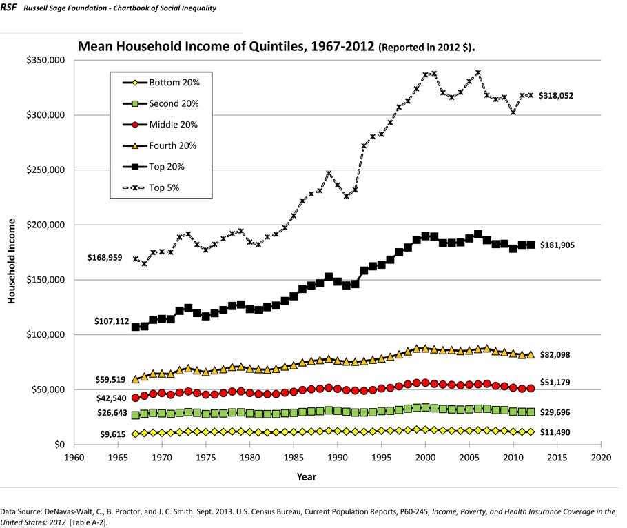
") It looks a little bit different when adjusted for inflation....
It looks a little bit different when adjusted for inflation....