okay, thank you.
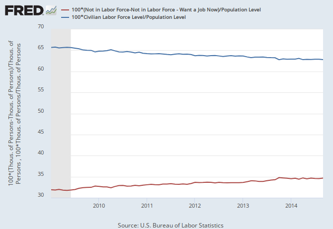
1) the 'nice chart' you posted was, no offense, almost a complete waste of time. It is one of those charts that uses two totally different measurements PLUS posts them using data that appears to go up/down to the same percentage...when the two stats are measured using very different variances.
I.E. the data on the left goes up using intervals that are roughly half of the percentage intervals of the data on the right.
Obviously, whomever made this chart desired to make the two lines look like they are going in matching, opposite directions..when they statistically are not.
That is why I try not to pay attention to 'nice charts'...they are little more then visual aids. And sometimes they visually distort the truth.
The raw data is (IMO) almost always a better source.
2) I think we have been over this before.
If you have a point to make, please make it using only the BLS site because I still cannot find what you are talking about.
Are you talking about the A-16 chart?
Table A-16. Persons not in the labor force and multiple jobholders by sex, not seasonally adjusted
Come on man, some of us have lives and have better things to do then track down the sources for your theories/ideas.